Light Healer - FanArt / (ESP/ENG)
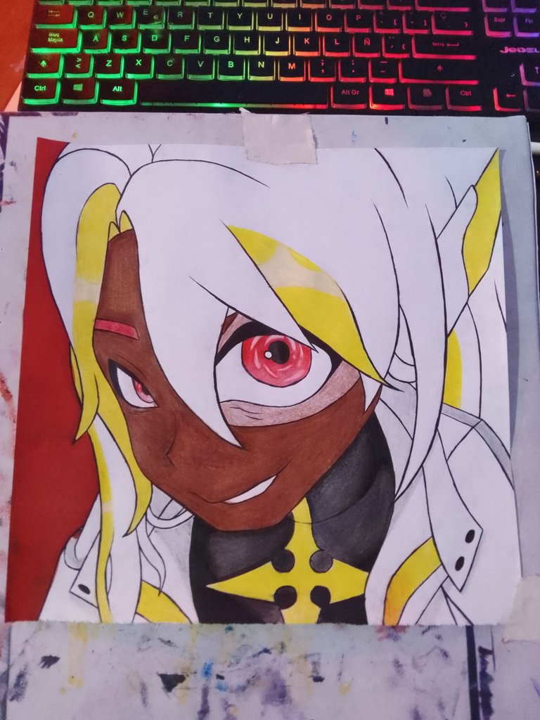
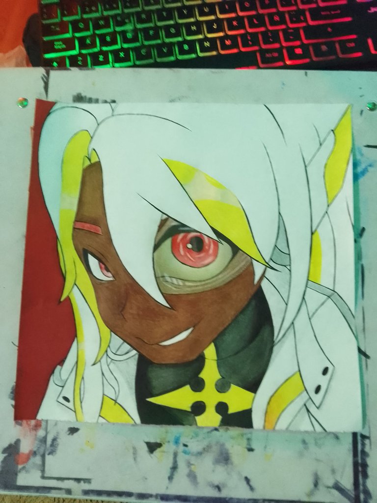
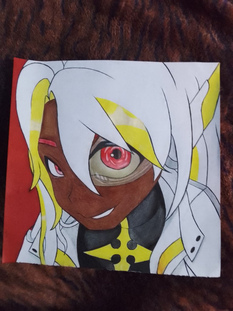
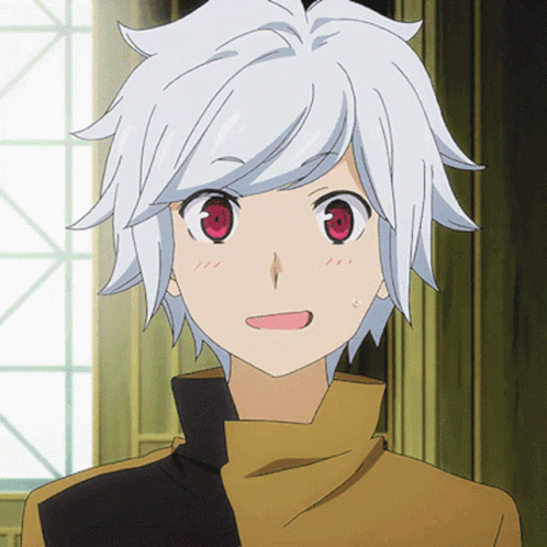
Continuando la temática de los Healers, acá les traigo una variante de un Light Healer alternativo, podría decirse así, ya que es una versión ya hecha oficial, pero con colores distintos y me llamo mucho la atención que este usa un visor como en los de Dragon Ball y se me ocurrió una forma o perspectiva distinta para este diseño.
Imaginen al personaje viendo a la lente ovalada de una cámara y esta sale de forma redondeada y hace detallar un poco más lo que es el visor, resaltando también el ángulo y los ojos que es la idea principal.
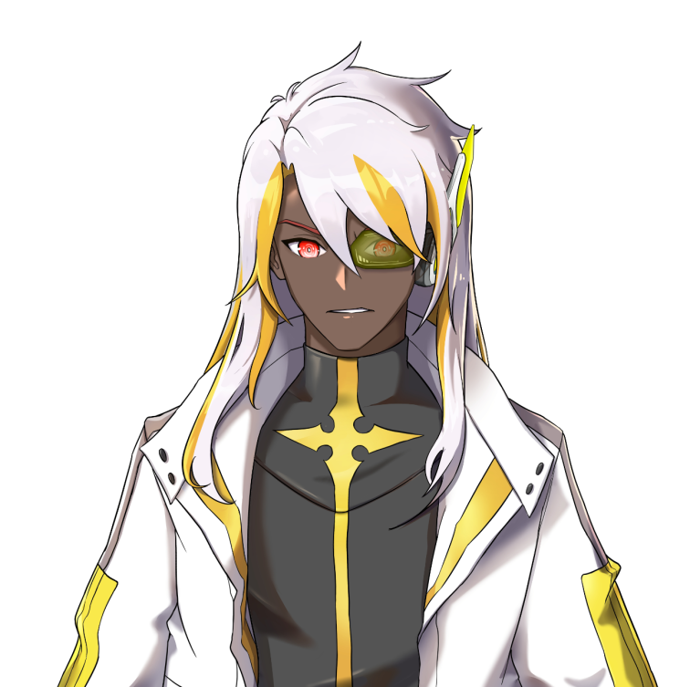

Como referencia tenemos al personaje de Holozing que usaré para el dibujo, el cual por sus ropas nos damos cuenta de que es un Light Healer.
Nos dedicaremos a colorear o mezclar todos esos colores y tratar de hacer ese degradado tan característico y me llamo mucho la atención.
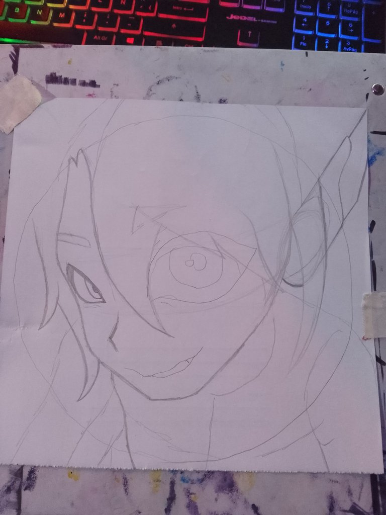
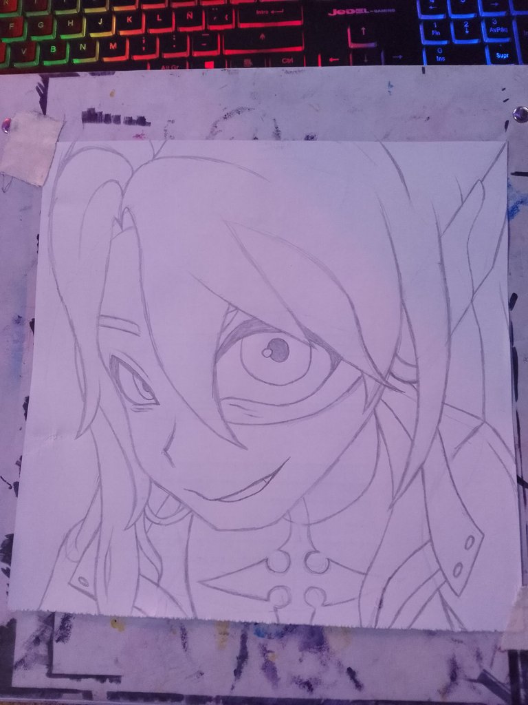
Aquí hacemos un esquema de lo que será la pose y partes, el cual estamos replicando, hay que fijarnos muy bien donde están ubicados.
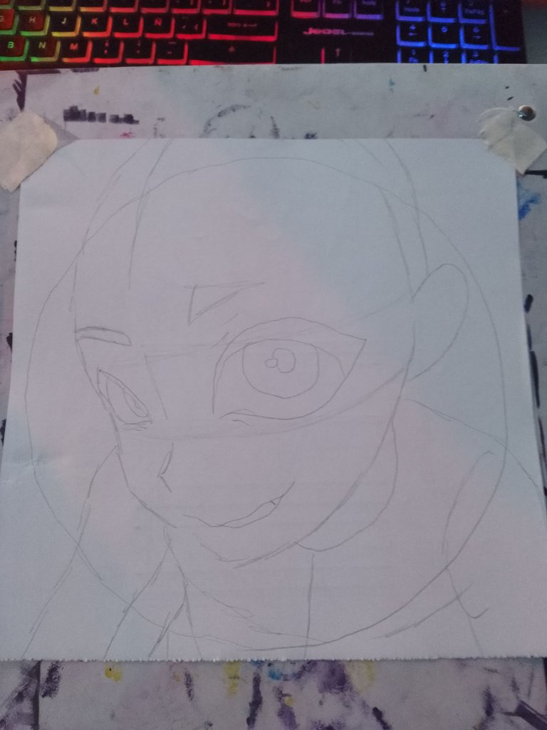
Tracé un círculo por encima del esquema, ya que eso me facilitara saber en qué parte va a ir más pronunciada y que otras debo reducir.
Luego colocamos los elementos situándolos lógicamente como se precian en los bocetos y la imagen de referencia.
 |  |  |
|---|
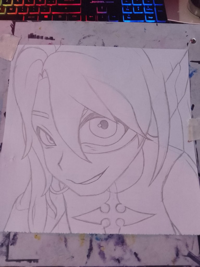
Una vez terminado el boceto, borramos todo para poder pintar y que el color no se nos manche en esta oportunidad voy a utilizar colores, esto me lleva a pensar en comprarme marcadores a base de alcohol para explorar nuevas técnicas y facilitar los dibujos pintando más rápido para hacer un estilo de dibujo blanco y negro.
COLOREANDO
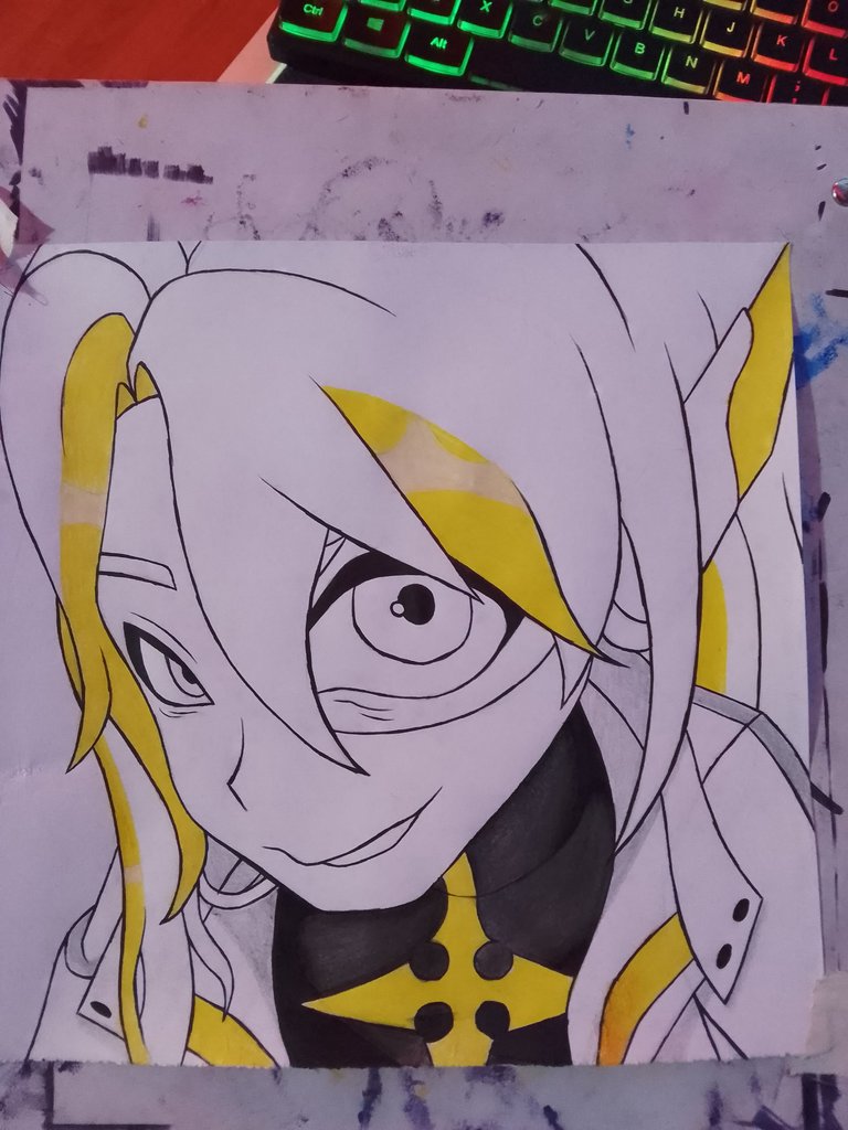
Al momento de colorear siempre empiezo por el color base, el cual estoy acostumbrado a que sea un tono muy claro para luego ir oscureciendo donde podrían ir las sombras del mismo color y así sucesivamente.
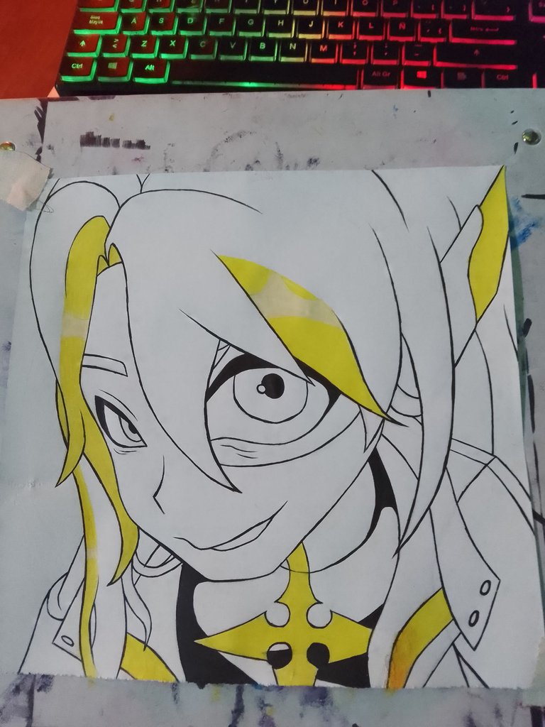
En este paso vamos a delinear todo muy bien con tinta china y marcador negro como base de coloreado para algunas partes de la ropa.

Ahora que estoy usando tinta china veo que al momento de borrar todo me queda mucho más pulido, claro hay que tener mucho cuidado para no manchar y que no se corra la tinta.
Hay 2 métodos, con plumilla o unos que venden con gel que son como lapiceros, de este último es el que yo uso y aplico antes del color, ya que si aplicamos encima de color se obstruyen y se dañan.
 |  |
|---|
Y como pueden ver dejo en las zonas oscuras o negras un espacio en blanco, ya que hay va situada luz o sombra, en este caso es la luz así que deber ser un tono más claro.
 |  |  |
|---|
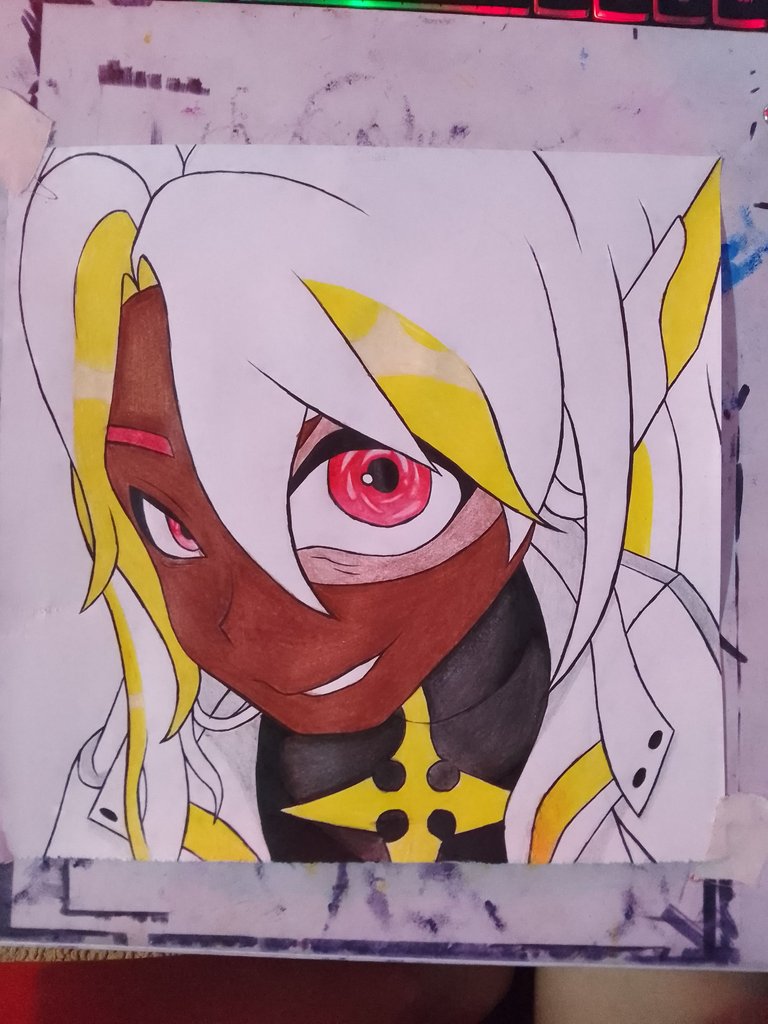
La transparencia se logra con blanco y pasando un color muy suave y luego degradar con blanco, un color que no solemos usar, pero da unos resultados muy buenos.
Ya terminado el diseño he de decir, aunque me gusta mucho el resultado, aunque con práctica y constancia siempre se puede mejorar.
.................................................................
F U L L // A R T
.................................................................
Considera unirte a nuestro trail de curación en HIVEVOTE haciendo clic en la imagen inferior, Les agradecemos todo el apoyo.

A todos los artistas ahí afuera en HIVE, si alguna vez se sienten solos y perdidos, únanse al canal de Discord de Bokura No Digital World
! [ENGLISH VERSION GENERATED BY GOOGLE TRANSLATE]
Continuing with the Healer theme, here I bring you a variant of an alternate Light Healer, so to speak, since it's an already official version, but with different colors. I was struck by the fact that this one uses a Dragon Ball-like visor, and I came up with a different shape or perspective for this design.
Imagine the character looking through the oval lens of a camera, and the lens comes out rounded, giving a bit more detail to the visor, also highlighting the angle and the eyes, which is the main idea.
As a reference, we have the Holozing character I'll be using for the drawing. From his clothes, we can tell he's a Light Healer.
We'll focus on coloring or mixing all those colors and trying to create that distinctive gradient, which really caught my attention.
Here, we'll make a diagram of what the pose and parts will be, which we're replicating. We have to pay close attention to where they are located.
I drew a circle above the outline, as this would make it easier for me to know which parts would be more pronounced and which others I should reduce.
Then we placed the elements, logically positioning them as shown in the sketches and the reference image.
| | |
|---|
Once the sketch is finished, we erase everything so we can paint and so the color doesn't get stained. This time I'm going to use colors. This leads me to think about buying alcohol-based markers to explore new techniques and make drawings easier by painting faster to create a black and white drawing style.
COLORING
When coloring, I always start with the base color, which I'm used to using as a very light shade, then darken where the shadows of the same color might go, and so on.
In this step, we'll outline everything very clearly with India ink and a black marker as a base color for some parts of the clothing.
Now that I'm using India ink, I find that when I erase, everything looks much more polished. Of course, you have to be very careful not to smudge or run the ink.
There are two methods: with a nib or ones sold with gel pens that are like pens. The latter is the one I use, and I apply it before applying the color, since if we apply it on top of the color, it clogs and gets damaged.
| |
|---|
And as you can see, I leave a blank space in the dark or black areas, since there is light or shadow, in this case it is light, so it should be a lighter tone.
| | |
|---|
Transparency is achieved by using white and a very light color, then blending with white, a color we don't usually use, but it gives very good results.
Once the design is finished, I have to say that although I really like the result, with practice and perseverance, it can always be improved.
.................................................................
F U L L // A R T
.................................................................
Grateful to all of you who are also part of my life. 💖
Well, from here I say goodbye, I hope you like my work like I do every day that I see and know that there are people dedicated to commenting on me and giving me encouragement to continue.
Fantástico el acabado que le das a las iluminaciones. Eres muy talentoso. ¡Bravo!
Gracias amigo @roswelborges me agrada verte por mis post de cierta manera me dan alegria y perseverancia para seguir, poco a poco voy mejorando
@tipu curate 7
Upvoted 👌 (Mana: 0/70) Liquid rewards.
Thanks!