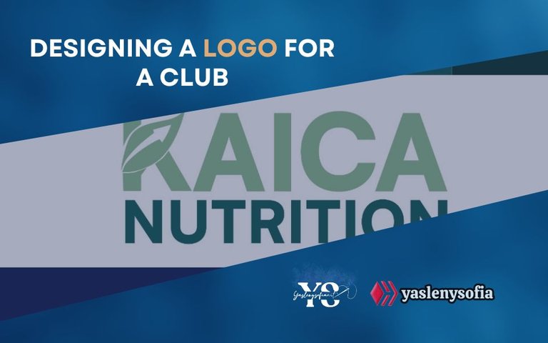
Designing a club logo / Diseñando un logotipo para un club [ENG/ESP]
ENGLISH
Greetings @GEMS community…
Two weeks ago, where I work, they had a logo made for a nutrition club they are forming, which only provided this information (verbatim):
From here, I would have to see what elements and colors would stand out better, so I had to research more in depth, information, colors, shapes and so on; I helped myself with the AI to guide me, especially for the shapes and colors, giving me suggestions, which helped me a lot, because you really ask the client all that, what he wants to project, the personality he wants to have, the colors in which he projects himself and many other things. However, they only provided the above information.
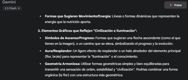
Screenshot of what I was getting from the AI
Screenshot of what I was getting from the AI
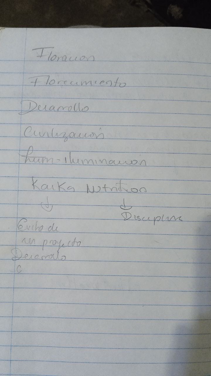
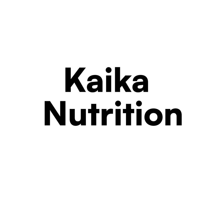
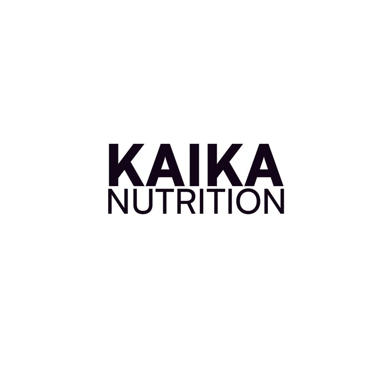
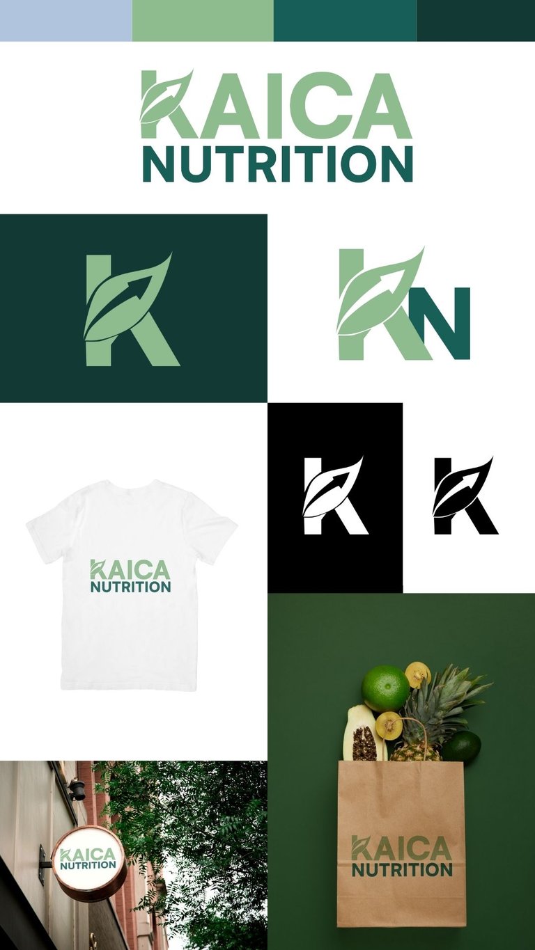
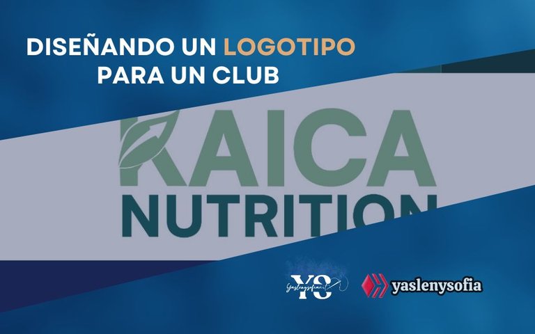
Before continuing with the shapes to use, I focused on the typography to use, which should also reflect the progress that the brand wants to convey, but that feels modern and simple, finding that the one called “Satoshi”, which symbolizes “a modern and clean aesthetic, associated with the industrial era and modernism”, seemed perfect, as one of the elements that Kaika refers to is civilization and enlightenment. I had my doubts whether to use the name in lowercase, deciding to use capital letters, as it reflected authority and solidity and it is something that I know that the head of the club likes to emit in the designs they send us to do.
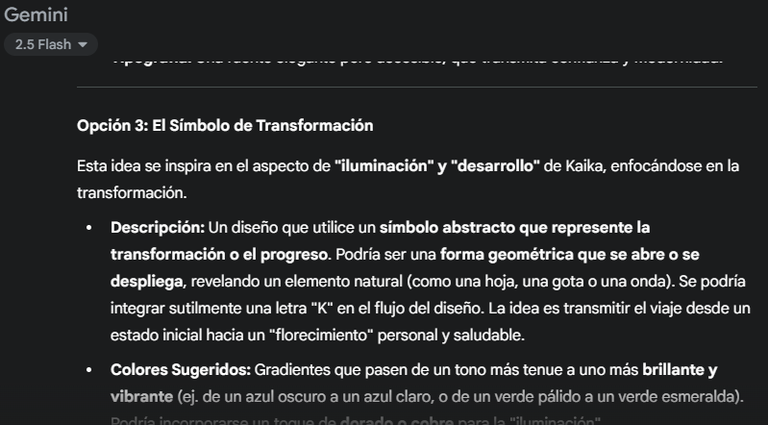
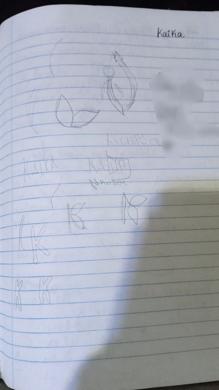
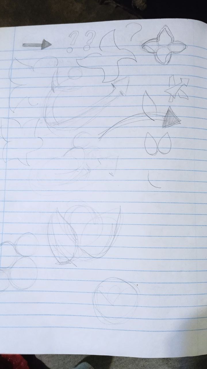
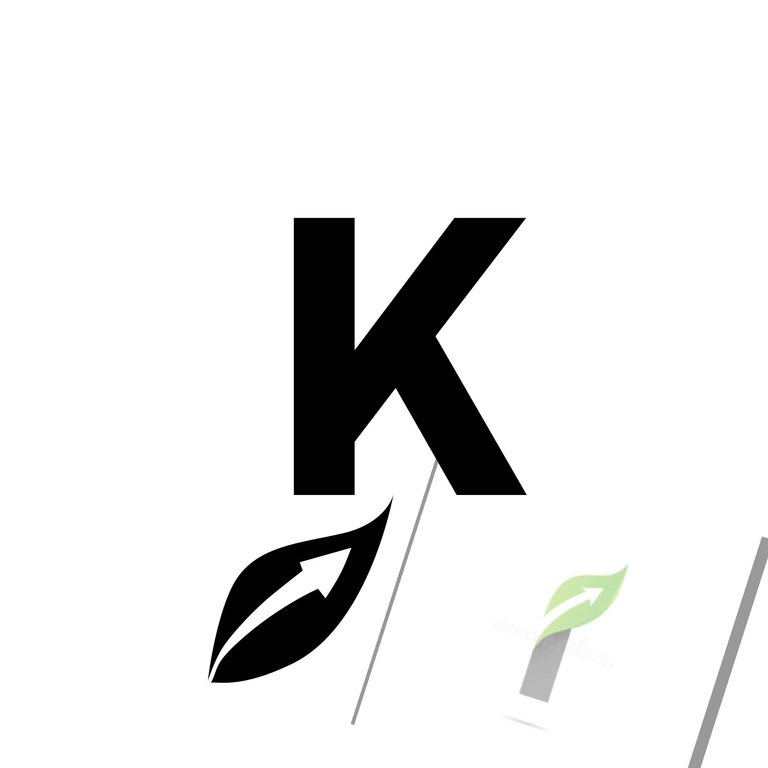
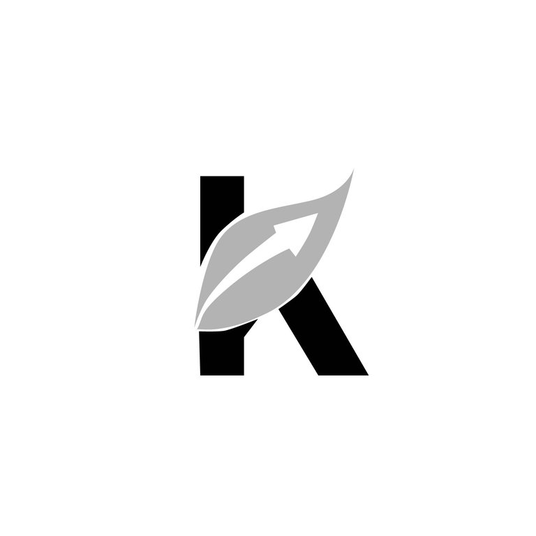
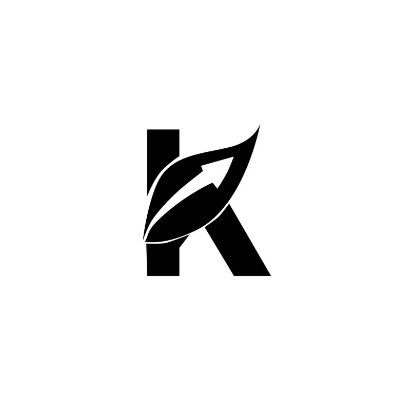
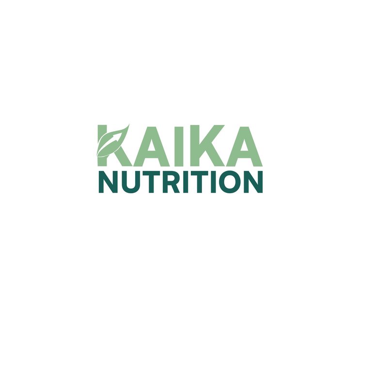
I was making sketches, what stood out and was repeated in both the meaning of Kaika and nutrition was the flowering, a natural element, so I thought of a leaf, however, this element alone, did not give that allusion to development, to what I feel they want to convey in their club, so I inquired much more and usually, when you want to symbolize progress, rise, it is represented with an arrow ascending. Then, it occurred to me that, to take advantage of the large vein of the leaf, to make an arrow ascending and that this leaf would join with the initial K of Kaika, eliminating a section of the typography and putting the leaf, playing a little with the principle of proximity and taking into account that the simpler the better.
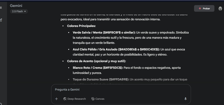
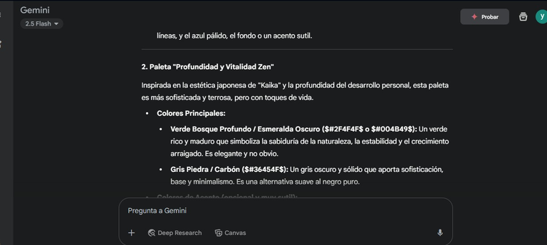
Once I had the shape of the logo, the colors came, where here I wanted to focus more on that part of nutrition, of freshness, to give that feeling of familiarity. You may notice that I asked Gemini, and I accepted their suggestions and through it, I searched for similar options in Google and I came up with these: #8fbc8f (Medium Green) that evokes growth, vitality, health and wellness, among others and #165e57 (Dark Forest Green) that conveys wealth, sophistication, stability.
Screenshot of what I was getting from the AI
Screenshot of what I was getting from the AI
Screenshot of what I was getting from the AI
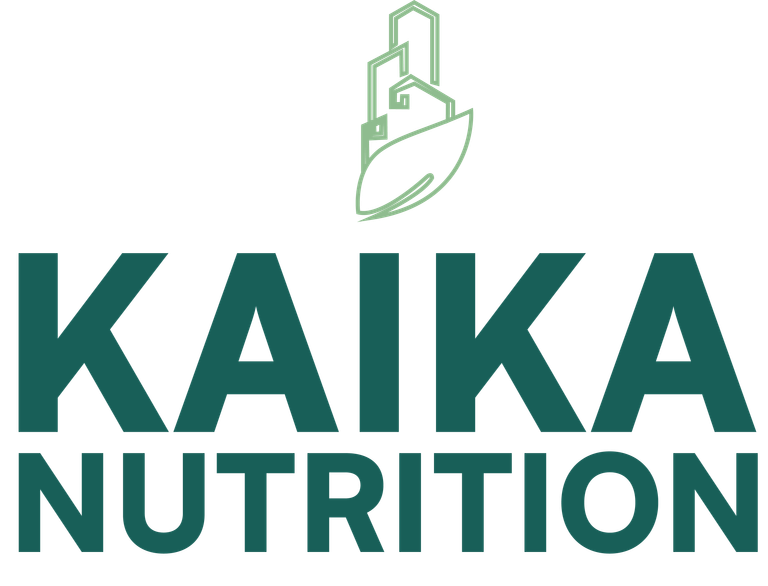
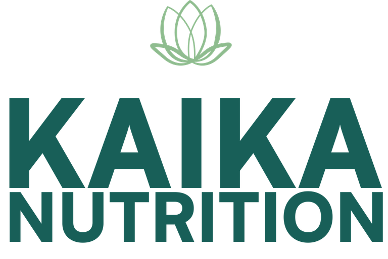
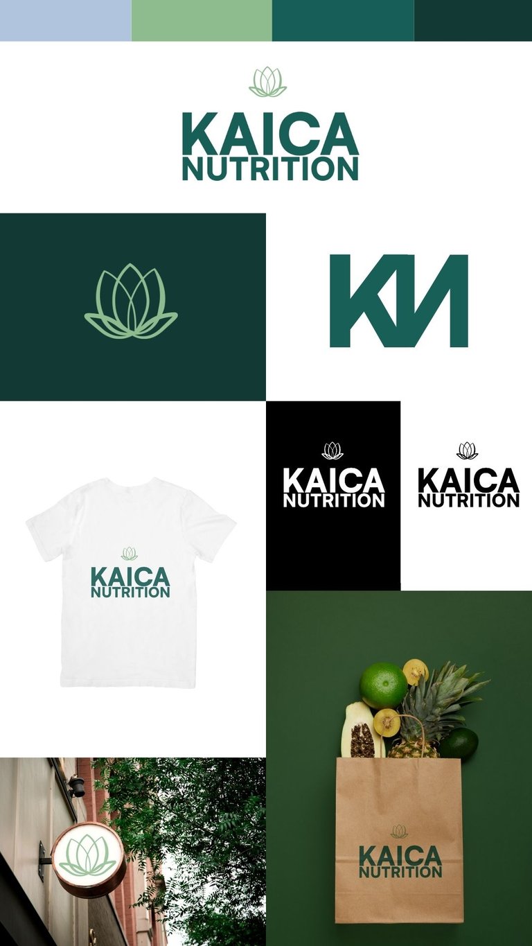
Both colors felt that it connected with the idea that was brewing; I passed it to me to my boss, however, I did as a presentation, how it would look on a poster or a shirt and suggesting a color palette, short versions and positive and negative of the same, in what she tells me that it has potential, but to generate other ideas more, sending example of flowering and that. I made many, I leave you some of them, in which most of them told me that it looked like a florist, that nothing to do and well, she also passed one that she made, I noticed more or less that, especially in color.
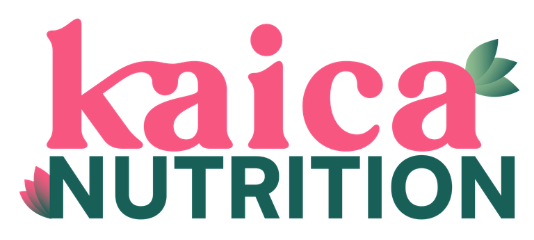
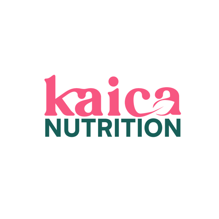
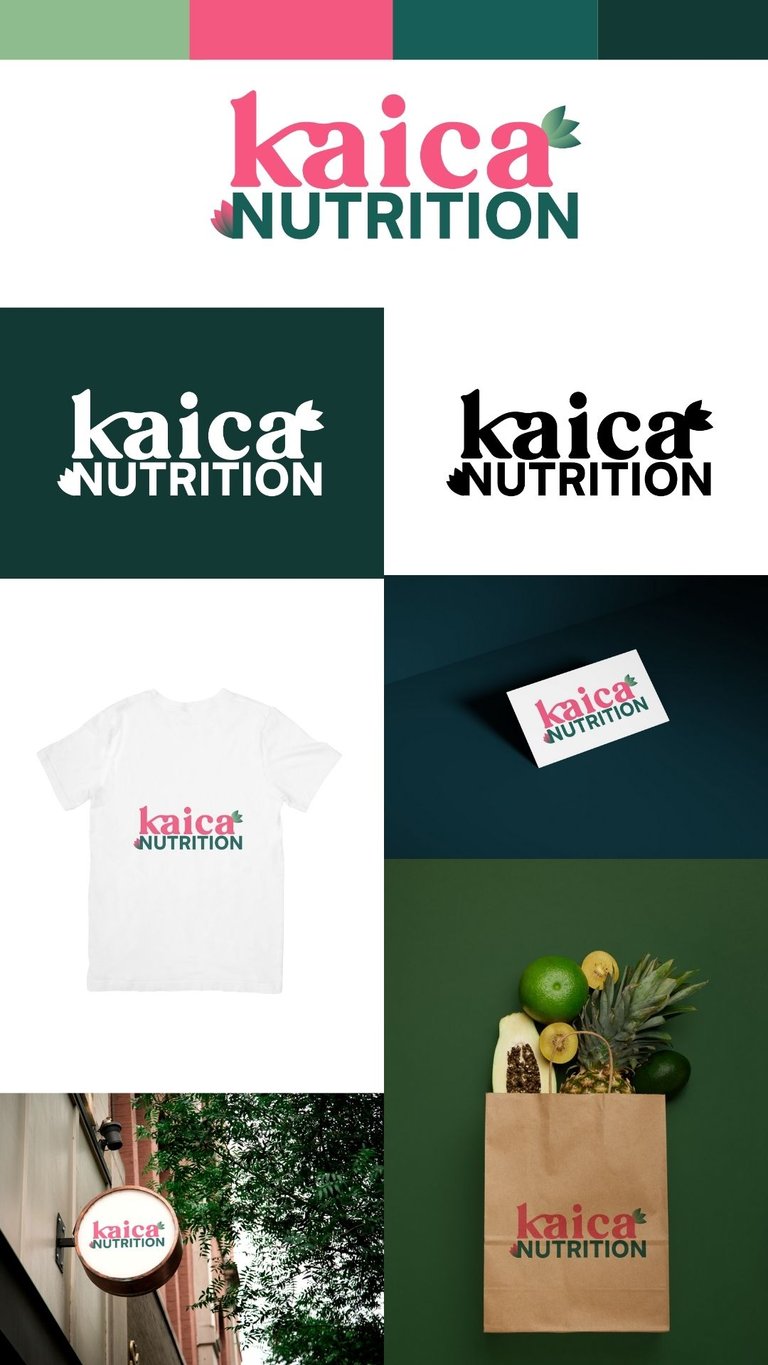
This is my cousin's proposal
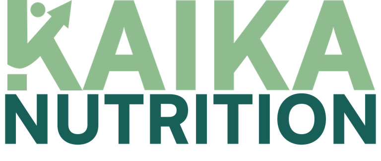
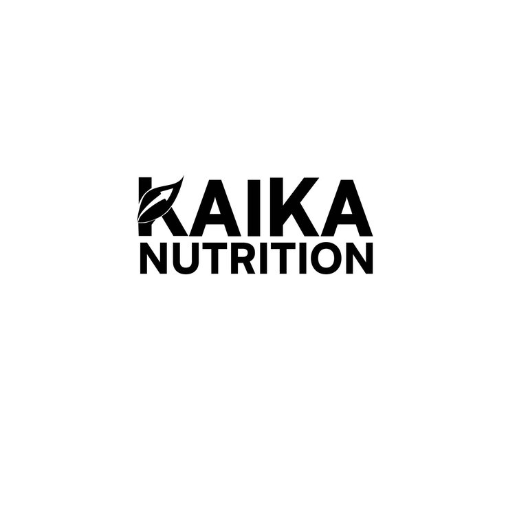
After doing all of them, she passes 3 proposals, hers, mine from the beginning and another one (here I leave you which were) and guess which one they ended up selecting, well yes, the one I had done at the beginning, for that one it took me almost 5 days, I had done a lot of research, I asked, I soaked up the term, I did not do it for the sake of doing, there was a lot of study behind it, and I was so happy that they chose it, the only thing is that I made so many because none of them fit to another person, following their suggestions, but well, that's how this world is, the good thing is that they were very happy, they reflected what they were looking for and it was simple, despite the detail of the leaf and the arrow, which many may not detail, it was what they wanted after all.
And up to here all my experience making this logo, which is the second one I do and little by little I'm learning and improving, I hope you liked it.
Thank you for reading my post. I hope you liked it. I will be attentive to answer your comments. You can visit my blog, follow my content and social networks.
FACEBOOK / INSTAGRAM / TWITTER
ESPAÑOL
Saludos comunidad @GEMS…
Hace dos semanas atrás en donde trabajo, mandaron hacer un logotipo para un club de nutrición que están formado, el cual solo proporcionaron esta información (textualmente):
A partir de aquí, tendría que ver que elementos y colores resaltarían mejor, por lo que tuve que investigar más a fondo, información, colores, formas y demás; me ayudé de la IA para guiarme, sobre todo para las formas y colores, dándome sugerencias, lo cual me sirvió de mucho, porque realmente uno le pregunta al cliente todo eso, que quiere proyectar, la personalidad que desea tener, los colores en el que se proyecta y muchas otras cosas. Sin embargo, solo proporcionaron la información de arriba.
Captura de pantalla de lo que me arrojaba la IA
Captura de pantalla de lo que me arrojaba la IA
Antes, de continuar que formas usar, me enfoque en la tipografía a emplear, la cual también debía reflejar ese progreso que la marca quieren transmitir, pero que se sienta como moderna y sencilla, encontrando como la denominada “Satoshi”, la cual simboliza “una estética moderna y limpia, asociada a la era industrial y al modernismo”, me parecía perfecta, pues una de los elementos que refiere Kaika es la civilización e iluminación. Tenía mis dudas si usar el nombre en minúscula, decidiéndome todo en mayúscula, ya que reflejaba autoridad y solidez y es algo que sé que el jefe del club le gusta emitir en los diseños que nos mandan hacer.
Estuve haciendo bocetos, lo que mucho se resaltaba y se repetía tanto en el significado de Kaika como el de nutrición era la floración, un elemento natural, por lo que pensé en una hoja, no obstante, este elemento solo, no daba esa alusión a desarrollo, a lo que siento que quieren transmitir en su club, por lo que indague mucho más y por lo general, cuando quieres simbolizar progreso, subida, se representa con una flecha ascendiendo. Entonces, ahí se me ocurrió que, para aprovechar la vena grande la hoja, hacer una flecha ascendiendo y que esta hoja se uniera con la K inicial de Kaika, eliminando un tramo de la tipografía y ponerle la hoja, jugando un poco con el principio de proximidad y atendiendo a que mientras más simple, mejor.
Al tener ya la forma del logotipo, venia los colores, donde aquí quería enfocarme más en esa parte de nutrición, de frescura, que diera esa sensación de familiaridad. Podrán notar que le pregunté a Gemini, y acepté sus sugerencias y a través de ello, busqué opciones similares en Google quedándome con estas: #8fbc8f (Verde Medio) que evoca al crecimiento, vitalidad, salud y bienestar, entre otras y el #165e57 (Verde Bosque Oscuro) que transmite riqueza, sofisticación, estabilidad.
Captura de pantalla de lo que me arrojaba la IA
Captura de pantalla de lo que me arrojaba la IA
Captura de pantalla de lo que me arrojaba la IA
Ambos colores sentían que conectaba con la idea que se estaba gestando; se lo pase a mí a mi jefa, no obstante, hice como una presentación, de cómo se vería en un cartel o en una camisa y sugiriendo una paleta de colores, versiones cortas y en positivo y negativo del mismo, en lo que ella me dice que tiene potencial, pero que generara otras ideas más, enviando ejemplo de floración y eso. Hice muchos, les dejo algunos de ellos, en el que la mayoría me decía que parecía de floristería, que nada que ver y bueno, ella también paso uno que hizo, yo me fije más o menos de eso, sobre todo en el color.
Esta es la propuesta de mi prima
Después de hacer todos ellos, ella pasa 3 propuestas, la suya, la mía del principio y otra más (aquí les dejo cuales fueron) y adivinan cual terminaron de seleccionar, pues si, la que había hecho en un inicio, para ese me llevo casi 5 días, había hecho mucha investigación, pregunté, me empapé del término, no lo hice por hacer, había mucho estudio detrás de este, y me alegró tanto que lo escogieran, lo único es que hice tantos porque ninguno le cuadra a otra persona, siguiendo sus sugerencias, pero bueno, así es este mundo, lo bueno es que quedaron muy contentos, reflejaban lo que ellos estaban buscando y que era sencillo, a pesar del detalle de la hoja y la flecha, que muchos pueden que no detallen, era lo que querían al fin y al cabo.
Y hasta aquí toda mi experiencia haciendo este logotipo, el cual es el segundo que hago y poco a poco voy aprendiendo y mejorando, espero les haya gustado.
Gracias por leer mi post. Espero que les haya gustado. Estaré atenta a responder sus comentarios. Pueden visitar mi blog, seguir mis contenidos y redes sociales.
FACEBOOK / INSTAGRAM / TWITTER
Posted Using INLEO
0
0
0.000
0 comments