A drawing dedicated to mothers / Un dibujo dedicado a las madres [ENG/ESP]
ENGLISH
Greetings @sketchbook community…
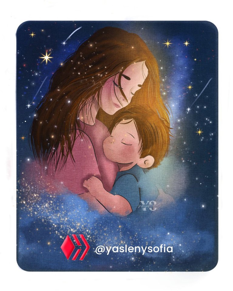
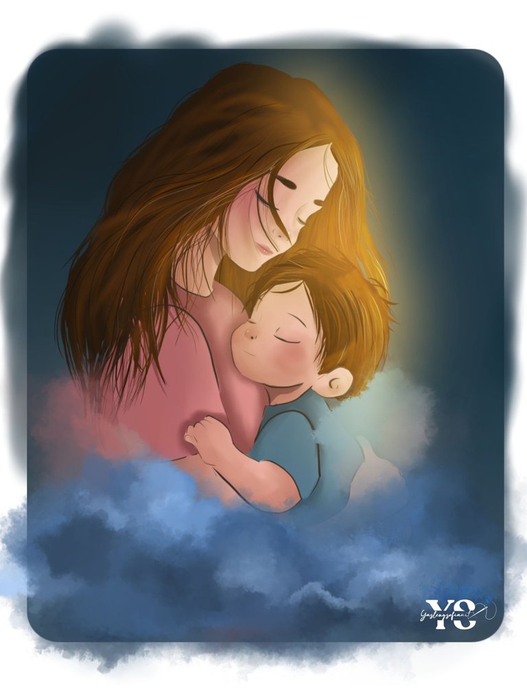
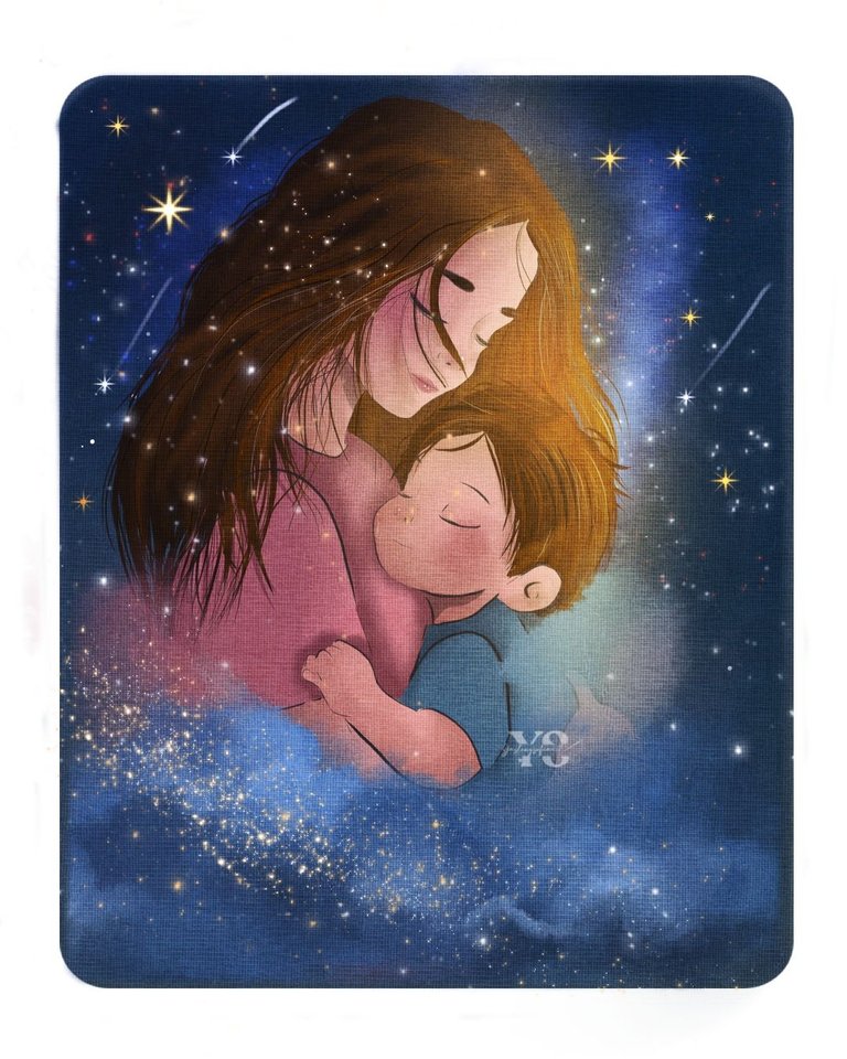
This Sunday 11 is already Mother's Day, although it should be every day and as I have been doing for some years now, I have made a drawing that symbolizes what mothers mean to us children. I hope you like the result.
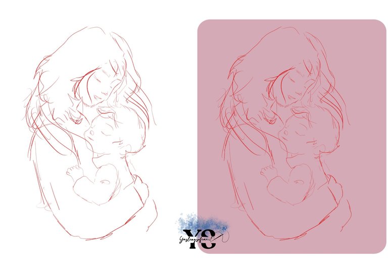
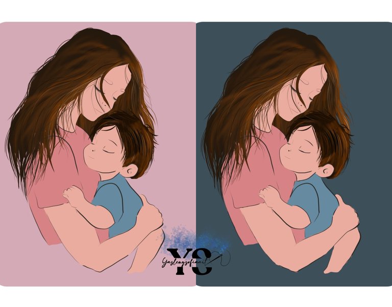
I always take as a reference my sister with my nephew, that is to say I have always drawn a child and carrying him, so I started by making the sketch and tracing a round point square, to color the background and see the tones better.
After that, I did the lines cleanly, without the hair, since I would color it directly, using different shades of browns and black. In both the mother's and the baby's hair.
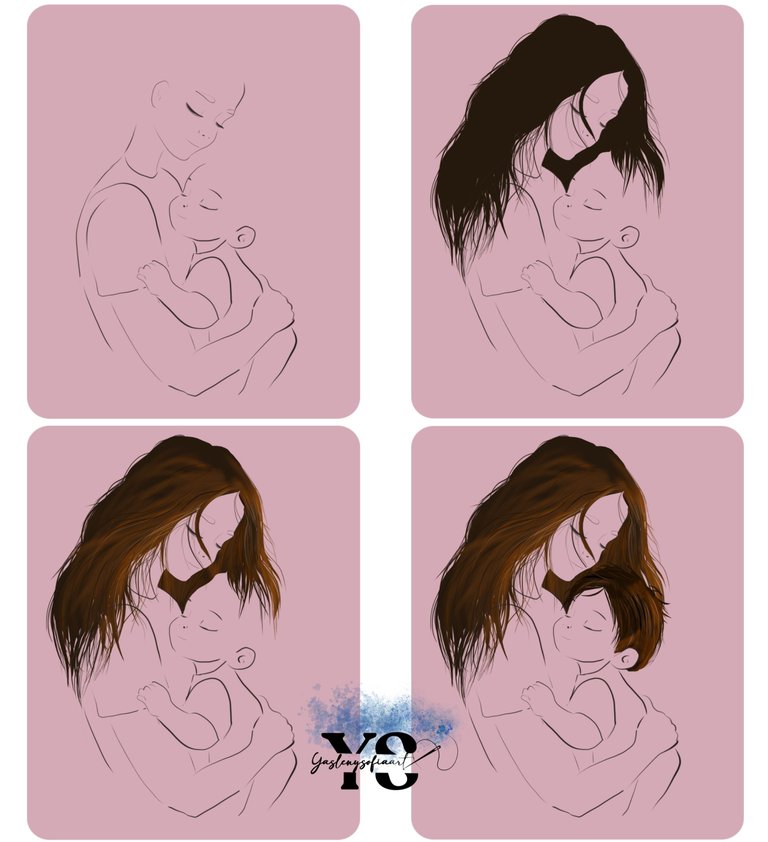
Next, I added the base colors and here I realized that the arm was weird, so I thought of making some clouds in front and the nightscape, because initially I wanted to do it in a diffuse landscape, but in the end I changed my mind, so you will see the background changed to a dark blue-gray.
With this, I began to give the lights and shadows to the figures, among other details.
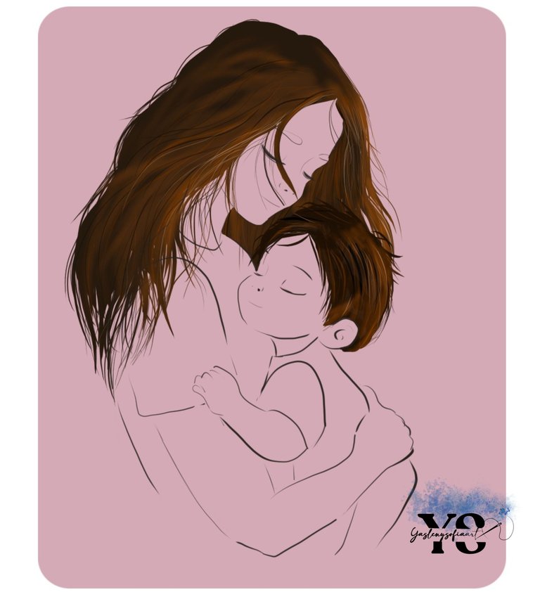
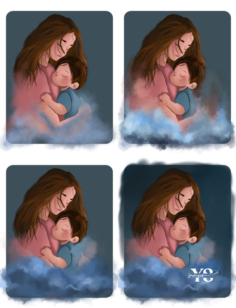
After that, I started to make the shapes of the clouds in the front area, playing with different shades of blue and some krita brushes, seeing which one worked for me and one helped me to blend the colors well. And not only I took colors of blue, also the tones of the skin and clothes, as if the figures were joined to the clouds.
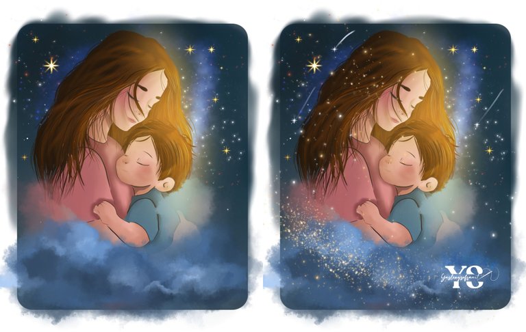
To darken the background, I illuminated more an area of the figures, with a yellow brush and the layer in blend mode add, stain part of the contour of the same, here I would not know if it would look good, but I trusted the process; to give it a Gaussian blur filter, to a point that blurred well, leaving that feeling of ambient light.
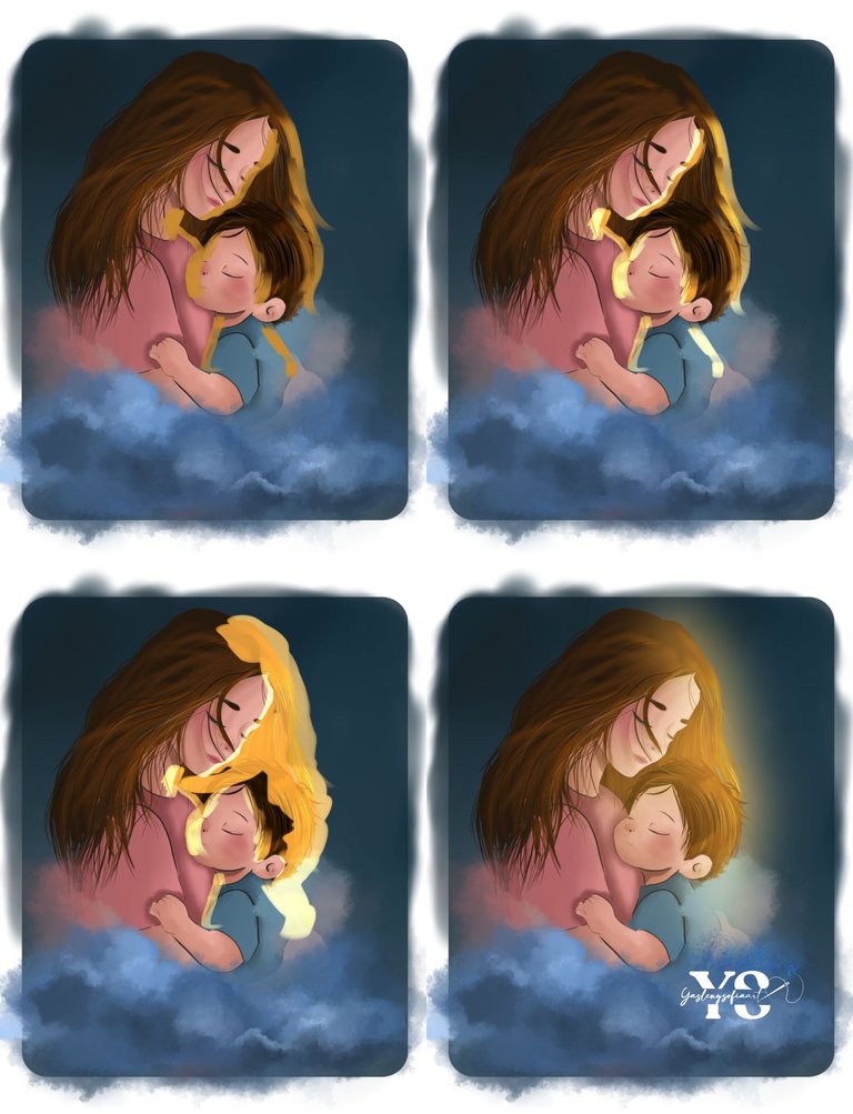
In it, I further detailed the background, with certain stars and well-lit particles, which I also added to the front part.
To finish, I added a texture layer, overlayed it and lowered the opacity, then added a blue gradient, set the blending mode to soft light and lowered the opacity.
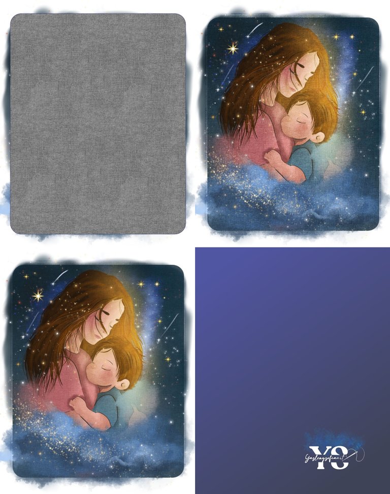
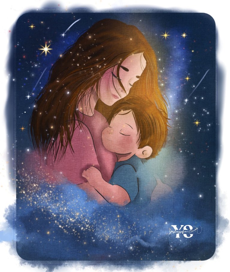
I eliminated the protrusions to make it look cleaner and this is the result...
Thank you for reading my post. I hope you liked it. I will be attentive to answer your comments. You can visit my blog, follow my content and social networks.
FACEBOOK / INSTAGRAM / TWITTER
ESPAÑOL
Saludos comunidad de @sketchbook…
Ya este domingo 11 es el día de las madres, aunque en realidad debería ser todos los días y como ya vengo haciendo desde hace unos años atrás, he realizado un dibujo que simbolice lo que las madres significan para nosotros los hijos. Espero les guste el resultado.
Siempre tomo como referencia a mi hermana con mi sobrino, es decir siempre he dibujado un niño y cargándolo, por lo que empecé realizando el boceto y trazando un cuadrado de punta redonda, para colorear el fondo y ver los tonos mejor.
Luego de ello, hice las líneas en limpio, sin el cabello, ya que lo colorearía directamente, empleando diferentes tonos de marrones y el negro. En ambos cabellos, tanto de la mamá como el bebé.
Seguidamente, agregué los colores bases y aquí me di cuenta que el brazo quedó raro, por lo que se me ocurrió de hacer unas nubes al frente y el paisaje nocturno, ya que inicialmente quería hacerlo en un paisaje difuso, pero al final cambié de opinión, por lo que verán el fondo cambiado a un azul-gris oscuro.
Ya con esto, comencé a darle las luces y sombras a las figuras, entre otros detalles.
Tras ello, empecé hacer las formas de las nubes en la zona de al frente, jugando con distintos tonos de azules y unos pinceles de krita, viendo cual me resultaba y uno me sirvió para que los colores se mezclaran bien. Y no solo tomé colores de azules, también los tonos de la piel y la ropa, como si las figuras se unieran a las nubes.
Al oscurecer más el fondo, iluminé más una zona de las figuras, con un pincel en color amarillo y la capa en modo de fusión sumar, manches parte del contorno de las mismas, aquí no sabría si quedaría bien, pero confié en el proceso; para así darle filtro desenfoque gaussiano, hasta un punto que se difuminada bien, dejando esa sensación de luz ambiental.
En ello, detallé más el fondo, con ciertas estrellas y partículas bien iluminadas, las cuales agregué también a la parte de enfrente.
Para ir finalizando, agregué una capa de textura, la superpuse y disminuye la opacidad, luego, le agregué un degradado en azul, le di al modo de fusión luz suave y disminuí la opacidad.
Eliminé los sobresalientes para que se viera más limpio y este es el resultado…
Gracias por leer mi post. Espero que les haya gustado. Estaré atenta a responder sus comentarios. Pueden visitar mi blog, seguir mis contenidos y redes sociales.
FACEBOOK / INSTAGRAM / TWITTER
Posted Using INLEO
0
0
0.000
🥰🥰