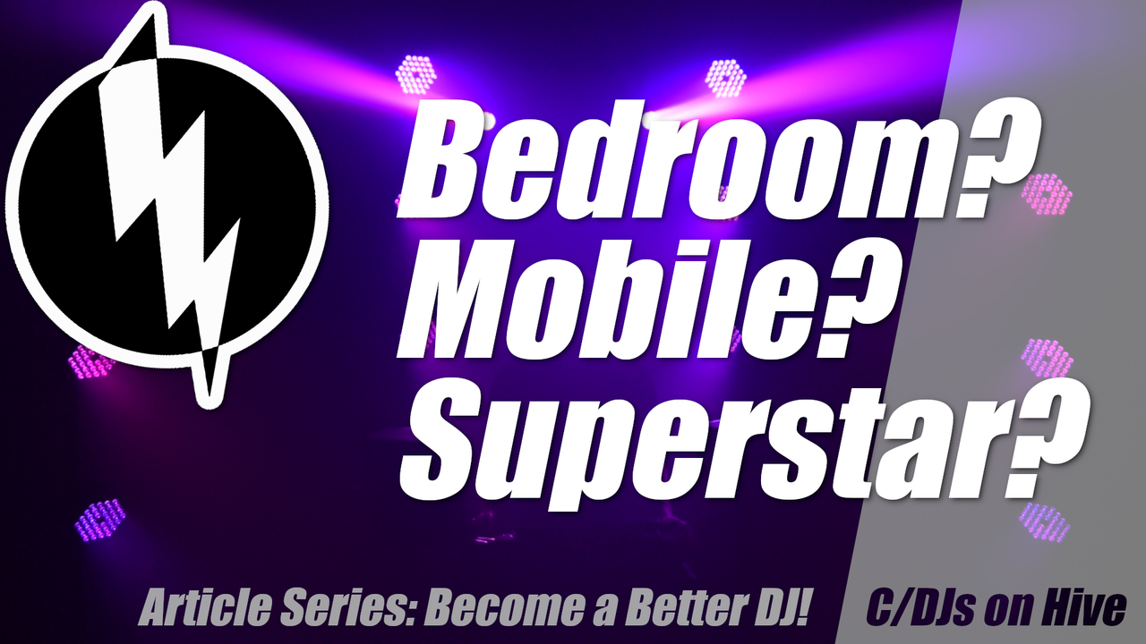
[ENG/DEU] Over 7 Years: The Evolution of My Title Images. You Can Learn Something from That!
I think we'll do this with music more often in the future...
Hintergrundmusik, die zum Titelbild und vielleicht auch zum Thema passt? (Ecency zerstört den Code [ich habe sie bereits gefragt, das anzupassen], inleo bietet dies generell nicht an. Nutze einfach das beste UI: Peakd. Link zum Artikel aufPeakd.)
Ich glaube, mit Musik machen wir in Zukunft öfters so...

Even though my cover images are getting better and better, I recently came up with another idea on how to make them *even* better! And I thought it would be interesting to show the evolution over the past 7 years and explain a bit about it — surely you can learn something from this.
Let’s start with the oldest images and work our way forward step by step. Of course, I won’t show every single cover image, but rather a selection. This way we can illustrate the progression, but also take the chance to discuss one or two specific cover images.
Look at the article images. What is good, what is bad? Especially in such a compact form, comparisons are very easy and "mistakes" become obvious. And when you reach the bottom, think about how the images looked further up. The main point here is for you to learn something. I’m not saying that I do everything perfectly by now, but…
Note: this article uses layout formatting that is not supported on inleo.io. Simply use peakd.com or alternatively ecency.com to view this article properly.
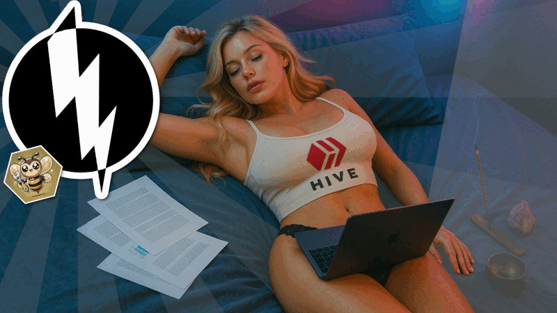
My first 5 posts and 4 cover images on HIVE (back then still STEEM):
My very first article on STEEM didn’t actually have a cover image at all! It was simply a music video from YouTube. Music not by me… basically a shit-post... Somehow, STEEM still pulled an image from it to use as a cover...
But starting with post #2, there were actual cover images. Honestly, I should have known better even back then — but yeah, that’s probably how almost everyone starts out:
Obwohl meine Titelbilder immer besser und besser werden, ist mir neulich eine weitere Idee gekommen, wie ich sie *noch* besser machen kann! Und ich habe mir gedacht, das ich die die Evolution der letzten 7 Jahre mal aufzeigen und etwas erklären will - sicherlich kannst du dabei etwas lernen.
Fangen wir bei den ältesten Bildern an und arbeiten und nach und nach vor. Ich zeige natürlich nicht jedes Titelbild, sondern eine Auswahl. Um den Verlauf aufzuzeigen, aber um auch mal das ein oder andere Titelbild zu besprechen.
Betrachte die Artikelbilder. Was ist gut, was schlecht? Gerade in so kompakter Form fällt ein Vergleich sehr leicht und "Fehler" schnall auf. Und wenn du unten angekommen bist, bedenke mal wie die Bilder weiter oben aussahen. Es geht hier primär darum, das du etwas lernen kannst. Ich will nicht sagen, dass ich mittlerweile alles geil mache, aber...
Warum ich dir dies zeigen will? Damit du es besser machen kann!
Hinweis: dieser Artikel nutzt Layoutformatierungen, welche auf inleo.io nicht unterstütz werden. Nutze einfach peakd.com oder alternativ ecency.com, um diesen Artikel anzuschauen.
Meine ersten 5 Beiträge und 4 Artikelbilder auf HIVE (damals noch STEEM):
Mein erster Artikel auf STEEM hatte tatsächlich kein Artikelbild! Es war einfach nur ein Musikvideo auf YouTube. Musik nicht von mir... Im Grunde ein Shit-Post... Ja, irgendwie hat sich STEEM daraus aber ein Artikelbild gezogen...
Nun aber tatsächlich, ab Beitrag 2, Titelbilder. Eigentlich hätte ich es damals schon besser gewusst, aber ja, so fängt wohl fast Jeder mal an:
 )
)
As with every image in this article: let it sink in for a moment. Would you click on the article behind it just because of the image? Is the image sufficiently original, attractive, enticing?
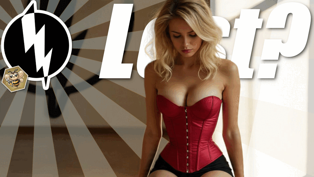
The cover image of Article 18 shines with an outstanding “I am oh so generic and from Pixabay. Please just skip me.”
Man sieht also: sehr generische Titelbilder - auch wenn Artikelbild 4 bereits ein Design war, welches ich folglich mehrfach genutzt habe. Immerhin waren alle Bilder schon von mir selbst erstellt. Naja, der Tweet...Wie bei jedem Bild in diesem Artikel: lasse es mal auf dich wirken. Würdest du den Artikel dahinter wegen des Bildes anklicken? Ist das Bild ausreichen originell, attraktiv, lockend?
Artikelbild von Artikel 18 glänzt mit hervorragender "Ich bin sowas von generisch und von Pixabay. Bitte skippe mich einfach."

Artikel 19 ist ebenfalls erwähnenswert. Weil einerseits kein schönes Bildformat und letztlich totaler Kladeradatsch. Viel zu viele Details, den Text kann man kaum lesen, weil der Hintergrund wiel zu farbintensiv und wild ist... Aber das erste Artikelbild mit Logo. Wir sind aber noch weit davon entfernt, dies als Erkennungszeichen zu etablieren. Auch wenn das Logo ab jetzt immer mal wieder auftauchen wird, geben wir uns noch keine wirkliche Mühe, es als konstantes Erkennungszeichen zu etablieren oder wirklich als optischen Stopper zu verwenden.
Artikel 21: Immerhin schonmal herausstechender Text, welcher auch gelesen werden kann, wenn das Bild sehr klein ist - wichtig.
Artikel 29. Jetzt wird es interessant! Ein Hingucker! Natürlich mit viel Liebe erstellt! Das wird mir immer und immer wichtiger. Das Logo setzt sich mehr und mehr durch - in dieser Transparenzstufe aber nicht wirklich ein optischer Stopper.
Artikel 30. Ja, nichts besonderes aus meiner heutigen Perspektive. Aber doch irgendwie lockend. Das Logo scheint etabliert zu werden - aber immernoch viel zu unauffällig, um Lesern und Fans im Feed klar zu signalisieren "Das ist ein Artikel von PowerPaul" - und darum geht es doch.
Ich werde jetzt nicht auf jedes Bild eingehen. Aber Artikel 33 ist verständlich: hier wird klar transportiert um was es geht.
Artikel 35: man hat das Gefühl, Paul würde nun eine klarere Bildsprache verwenden. Weniger Inhalt, einfacher strukturiert - das hilft die Aufmerksamkeit auf das zu lenken, wo man sie haben will, statt mit überladenen Details abzulenken.
Nun folgen erstmal ein ganz paar normale oder gar echt schlechte Artikelbilder. Offensichtlich hat Paul nicht wahrgenommen, was er bisher gut gemacht hat und was schlecht. Ein besonders schlechtes Beispiel ist Artikel 63. Das Bild ist 0 ansprechend, der Text in der Miniaturvorschau nicht zu lesen und was zur Hölle ist da eingekreist? Ein gutes Beispiel wie man es nicht macht:
Und wieder im Vergleich Artikel 65. Aber das Logo... naja, dann halt eben nicht als optischen Marker nutzen...
Und ab Artikel 67 nimmt Paul sich das erste mal ein wirkliches Erkennungszeichen. Was & wie, hier in der Übersicht:
Irgendwann gründet sich dann die @STEEMillu. Hier habe ich ebenfalls (nicht nur) die Titelbilder erstellt. Davon will ich euch ein paar zeigen, denn man kann klar erkennen, wie wir ein bestimmtes Schema transportieren und vollen Wiedererkennungswert haben.

Als Seitenprodukt haben wir dann irgendwann noch das Format "STEEMillu Community Transparent" erschaffen. Damit erkennt man gut, das man auch unterschiedliche Themen fahren kann, ohne seine Erkennungsmerkmale und Trigger zu verlieren. Für den Lernenden interessant: schau mal, wie der Hintergrund ein Overlay bekommen hat, um die Inhalte im Vordergrund zu betonen.
![]()
![]()
Und auch wenn die STEEMillu sich nach und nach optisch verändert hat, noch immer klar erkennbar:

Und sogar als das Grafikprogramm kaputt war, wurde das Schema weiter durchgezogen:
Zwischendurch sind bei PowerPaul aber auch wieder random Artikelbilder erschienen. Inhaltlich auch die Artikel unterschiedlichst. Aber auch, wenn man nicht viel Arbeit in das Design der Artikelbilder legen will, kann man eine gewisse Konsistenz schaffen:
I find this to be an important aspect. By now, PowerPaul stands for content-wise good articles. Sometimes funny, sometimes provocative, sometimes educational — there are regular readers. And they should be able to clearly recognize my articles in a long feed of random authors.
Hier könnte ich jetzt weitermachen mit random Artikelbildern, einem Designwechsel bei PowerPaul usw... Aber dann wird der Artikel ewig lang. Bisher haben wir schon einen recht guten Einblick erhalten, in gute und schlechte Beispiele. In klare und matschige und wilde Bilder. In langweilige und provokative, zum klicken anregende. Ich mächte aber den Moment hervorhaben, als ich dann im May 2023 das erste mal mein Logo klar als Erkennungszeichen verwendet (und weiterverwendet) habe.
Ich finde dies ist ein wichtiger Aspekt. Mittlerweile steht PowerPaul für inhaltlich gute Artikel. Mal witzig, mal provokant, mal lehrreich - es gibt regelmäßige Leser. Und diese sollen meine Artikel in einem langen Feed von random Autoren auch klar erkennen können.
Und um diese kurze Beispielreihe zu schließen: schau mal hier, wie klar das Bildarrangement ist. Optisch erkennbar, große Schrift mit genug Kontrast, klares Bildmaterial für alle Kenner.

Irgendwann habe ich dann die Schriftart von @CryptoCompany verwendet und andere Designelemente, wie zum Beispiel die orangen Flächen aufgegeben. Was aber konstant geblieben ist: mein Logo.
Dann gab es irgendwann mal eine kleine Artikelserie. Diese wollte ich optisch klar abgrenzen. Aber natürlich auch hier mein Logo. Hier sieht man mein "neues" Logo, welches ich aber nie konstant verwendet habe... Und auch die Schriftart, die ich eigentlich einführen wollte... Habe ich im DJ Bereich auch öfters, aber irgendwie bin ich bis heute dann doch bei meiner alten Schrift hängengeblieben...

But I want to pick up again at the starting point of another development. Namely, the point where the current article images began.
At first, this was "just" the design for my article about music and DJing...
An dieser Stelle will ich mal etwas vorwärts spulen. Der gespulte Zeitraum hat keine besonders guten oder schlechten Bilder inne. Zwischendurch mal ein Titelbild besser, mal schlechter. Nichts besonders, was ich aus Lehrzwecken besonders hervorheben müsste.Aber ich will am Startpunkt einer weiteren Entwicklung wieder einsteigen. Nämlich an dem Startpunkt, wo die aktuellen Artikelbilder begonnen haben.
Zuerst war dies "nur" das Design für mein Artikel über Musik und DJing...
Und irgendwie hat mir das grobe Schema gefallen und ich habe für Artikel, die nicht direkt "Werde ein besserer DJ!" sind, den Schriftstil und die Seitenleiste übernommen:
Um die kommenden Bildentwicklung aufzuzeigen, will ich auch meinen ersten "Musikbezogenen Fotowettbewerb" hier aufzeigen. Wie bisher (da hat Paul nun scheinbar *wirklich* gelernt): oben links das Label. Schrift und Seitenleiste könnten einem bekannt vorkommen, sind aber noch immer deutlich anders arrangiert, um sich entsprechend zu differenzieren.
Und irgendwie fand ich das Design grundlegend gut und habe es dann irgendwann auch für andere Inhalte, ohne Bezug zu Musik, übernommen. Und was einem ebenfalls auffallen kann: ich habe die Worker-Bee zu meinem Logo hinzugefügt. Weil ja, für manche Hivians symbolisierst du damit etwas. Nicht umsonnst werden die Bienen in deinem Profil als Auszeichnung angezeigt. Warum diese Auszeichnung und diesen Werbeeffekt auch außerhalb des Profils sichtbar machen?
Und jetzt kommen wir zu einem Meilenstein! Der Gedankengang dahinter ist klar: in einem Feed voller statischer Artikel fällt was auf? Richtig: Bewegung. Meine ersten bewegten Artikelbilder:


Und jetzt! Jetzt, kurz nach bewegten Bildern, kommt der nächste Meilenstein. Mehr nur durch "Zufall" integriert, aber während ich dies das erste mal integriert habe ist mir klargeworden: Paul, klar! Welche Wirkung! Wie doof bist du eigentlich?!
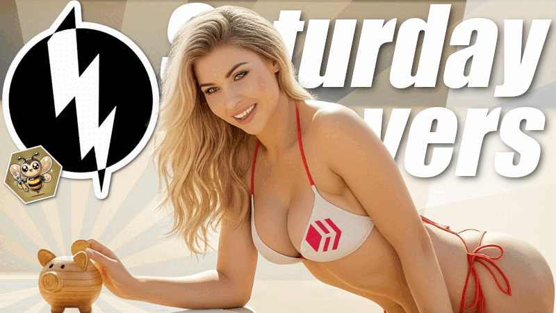
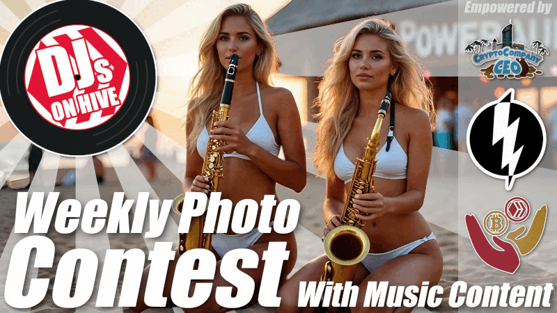
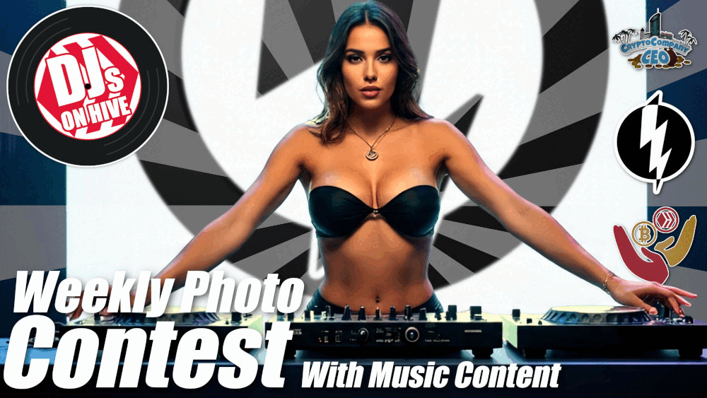
Und dementsprechend haben sich auch die Titelbilder für die musikbezogenen Fotowettbewerbe geändert. Wenn auch hier etwas zurückhaltender, als ich es manchmal für PowerPaul-Artikel mache:


I now try to shorten the text on the images as much as possible. And I like to design it so that it works subtly. This isn’t my highest priority, but I could expand on it... Yes, marketing. I always make sure that the text not only makes sense with the image but also aligns with the headline and the article content.
I don’t necessarily have to push the image content to the absolute limit — there’s definitely more that could be done. But even like this, it’s enough. In fact, I get a lot of positive feedback — although I was also asked at the Saturday Savers Club not to continue using such cover images because they weren’t "inclusive" enough. Fine, no problem. I’ll spare a comment on that — I don’t want to expose anyone or anything to ridicule.
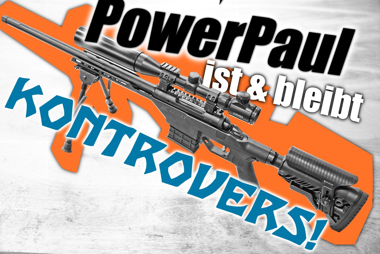
One more small note: I also like to integrate a signal color — if that’s still not enough signaling... Red?
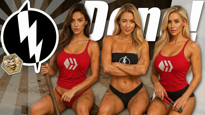
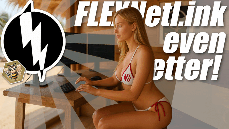
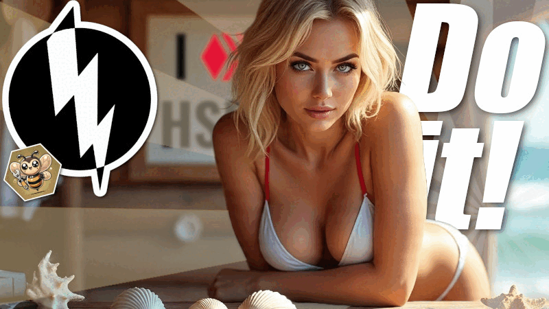
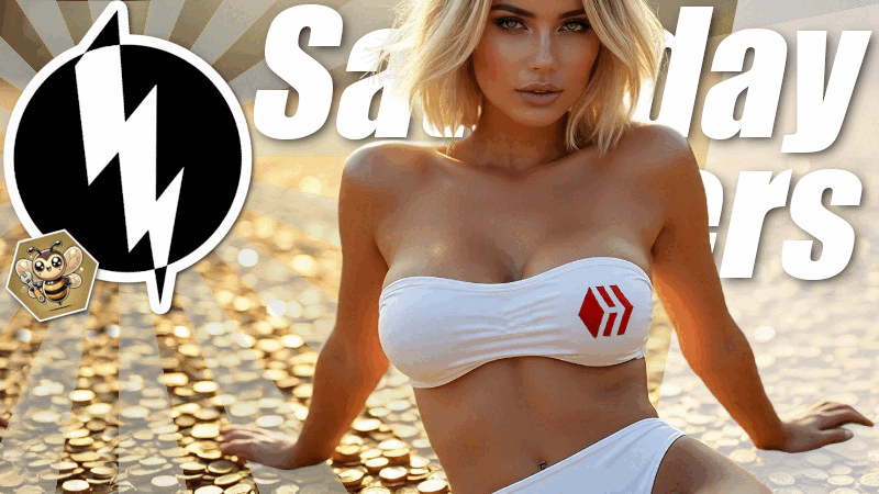
Here are a few more examples of my current "limit":
Ganz ehrlich? "Schon nicht schlecht". Wahrscheinlich ist es dir schon aufgefallen: ich versuche nicht nur Bewegung und hübsche Bildinhalte zu integrieren. Auch versuche ich Hive Inhalte oder das Logo von PowerPaul oder einen Schriftzug in das Bild zu integrieren. Warum? Weil es das Bildarrangement noch einzigartiger macht. Ja, es ist noch mehr Arbeit - aber Leute sollen sehen, das ich mir mit meinen Inhalten Mühe gebe; das hinter dem Artikelbild Qualität steckt. Leute sollen sehen und denken: "hier gibt sich jemand Mühe, das kuratiere ich."Den Text auf den Bildern versuche ich mittlerweile so weit wie möglich einzukürzen. Und gerne auch so zu gestallten, das er unterschwellig wirkt. Das ist nicht meine größte Priorität, aber das könnte ich noch ausbauen... Ja, Marketing. Dabei achte ich aber immer darauf, das er nicht nur mit dem Bild Sinn macht, sondern auch im Zusammenhang mit der Überschrift und dem Artikelinhalt.
Vom Bildinhalt muss ich jetzt nicht unbedingt an die absolute Grenze gehen - da ginge sicherlich noch mehr. Aber schon so reicht es. Tatsächlich bekomme ich sehr viel gutes Feedback - wurde aber auch schon beim Saturday Savers Club gebeten, mit solchen Artikelbildern nicht länger teilzunehmen, da sie nicht "inklusiv" genug sind. Gut, gerne. Einen Kommentar dessen erspare ich mir jetzt - ich will nichts und niemanden der Lächerlichkeit aussetzen.
Noch ein weiterer kleiner Hinweis: gerne integriere ich auch eine Signalfarbe - falls das alles noch nicht genug Signale sind... Rot?
Ein paar weitere Beispiele für meine aktuelle "Grenze":


Gut soweit? Gut soweit. Jetzt habe ich die letzten 4 Artikelbilder gemacht (von links oben nach rechts unten) und insbesondere beim Letzten ist mir aufgefallen... Was? Das sage ich euch im nächsten Absatz...
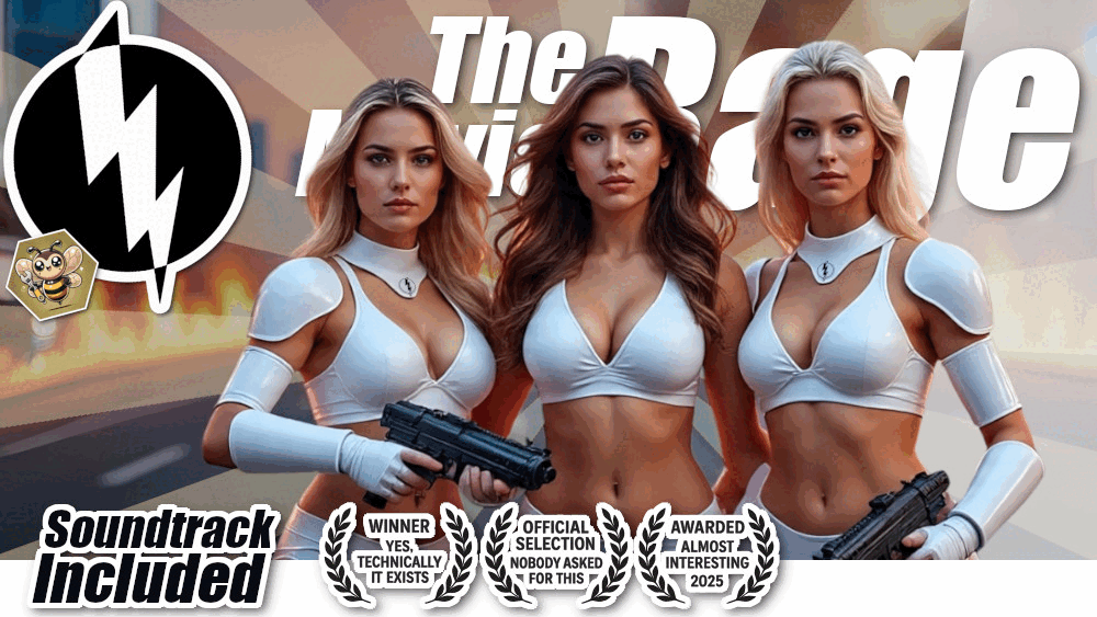
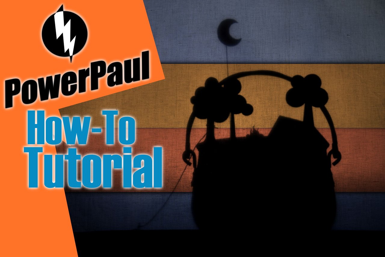
Take a look at the last cover image in the bottom right! Damn! That’s half a movie poster! Not quite yet – but I see the parallels in it! Don’t you?
And now you know why my current cover image looks the way it does. See those typical laurel wreaths? I recently saw in a game advertisement how laurel wreaths were used with completely nonsensical labels. I liked it! Because it’s clear what these "awards" are meant to convey! They are awards! Prizes, accolades, recognitions!
And why does this game advertisement use them even when the content is completely meaningless? Because they have a subtle effect. And honestly? Incorporating this fits very well with my profile here. Through the overview of the cover images here, you’ve gotten some perspective on the content presented. Yes, PowerPaul and his content are just... how PowerPaul and his content are. These laurel wreaths fit perfectly with their content! Not just because of the effect – but because Paul is sometimes ironic, a bit bold, pushes things a little... So...
I think the current scheme of the cover images is really not bad – although I don’t think we’re at the end of its development yet.
And of course, they involve a lot of work, which some would say is unnecessary. But let’s be honest: what I aim to convey with this is that effort is being made here, that there is nothing standard or generic... Cover images are such an important promotional aspect... Do you know anyone who creates similarly appealing cover images? Without wanting to sound arrogant: my cover images are better, more thoughtful, and more effective than the vast majority of cover images on Hive.
Is the work behind it worth it? Well... I don’t want to judge whether I am appropriately curated for my content. But what I see again and again: quality work pays off. And it also takes time to establish oneself. But I already have the feeling and the feedback that the more effort I put in, the greater the response.
If I were less rebellious, some curators would probably pay attention to me too... but that’s just how it is. And I prefer – and you’ll find here – PowerPaul. If I then question somewhere whether there is something on Hive that some call an oligarchy, or I sarcastically say “Long live LGTBQIDisney+” after questioning whether "inclusive and family-friendly" now also excludes beachwear or people, whether inclusion works through exclusion, after being asked somewhere not to participate anymore, well, that’s just how it is... Better to have PowerPaul here. And he is, like many others, unique. And therefore valuable and an enrichment. Cheers to that!
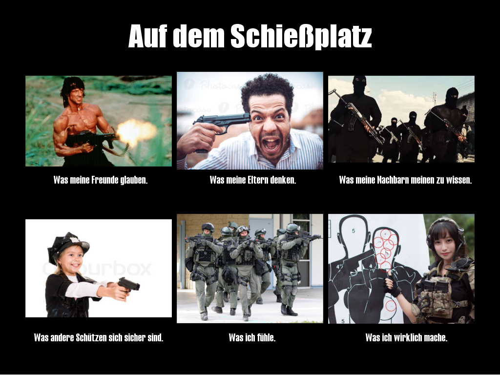
Siehst du was? Nein, es geht nicht um ein weiteres Kliesche, das ich nun auch noch Waffen ins Bild bringe. Wir können an dieser Stelle aber mal die größte Zielgruppe auf Hive betrachten... Die Ergebnisse meiner "Analyse" berichte ich jetzt nicht, aber in nur wenigen Sekunden wirst du sie selber grob umreißen können. Und auch die Recherche, welcher Typ von Frauen in welchem Kulturraum wie betrachtet wird. Darum geht es jetzt nicht.
Schau dir doch mal das letzte Artikelbild unten rechts an! Damn! Das ist ein halbes Filmplakat! Ist es noch nicht - aber ich sehe die Parallelen darin! Du nicht?
Und jetzt weißt du, warum mein aktuelles Titelbild so aussieht, wie es aussieht. Siehst du diese typischen Lorbeerkränze? Ich habe neulich in einer Spielewerbung gesehen, wie dies Lorbeerkränze mit völlig sinnbefreiten Bezeichnungen verwendet wurde. Fand ich gut! Weil ist doch klar, wie diese "Auszeichnungen" wirken sollen! Es sind Auszeichnungen! Preise, Awards, Anerkennungen!
Und warum nutzt diese Spielewerbung sie, auch wenn der Inhalt dessen total sinnbefreit war? Weil sie unterschwellig wirken. Und ganz ehrlich? Dies aufzugreifen passt sehr gut zu meinem Profil hier. Durch die Übersicht der Artikelbilder hier, habt ihr etwas Übersicht über die hier präsentierten Inhalte bekommen. Ja, PowerPaul und seine Inhalte sind halt... wie PowerPaul und seine Inhalte halt sind. Da passen diese Lorbeerkränze mit ihrem Inhalt super hinein! Nicht nur wegen der Wirkung - sondern weil Paul eben manchmal auch ironisch ist, etwas bold, es etwas ausreizt... Von daher...
Ich glaube das aktuelle Schema der Artikelbilder ist wirklich schon nicht schlecht - wobei ich noch nicht glaube, das wir schon am Ende der Entwicklung sind.
Und natürlich steckt in ihnen eine Menge an Arbeit, wo manche sagen würden, dies sei nicht notwendig. Aber jetzt mal ehrlich: was ich damit bezwecke zu vermitteln, dass hier Aufwand betrieben wird, dass es hier kein 08/15 gibt... Artikelbilder sind sooo ein wichtiger Werbeaspekt... Kennst du jemanden, der ähnlich ansprechende Artikelbilder erstellt? Ohne überheblich wirken zu wollen: meine Artikelbilder sind besser und durchdachter, wirksamer, als der absolute Großteil der Artikelbilder auf Hive.
Ob sich die Arbeit dahinter lohnt? Nun... ich will gar nicht bewerten, ob ich für meine Inhalte angemessen kuratiert bin. Was ich aber immer wieder sehe: Qualitätsarbeit zahlt sich aus. Und es dauert halt auch, sich zu etablieren. Ich habe aber schon das Gefühl und die Rückmeldung, umso mehr ich mir Mühe gebe, umso größer ist das Feedback.
Wenn ich jetzt noch weniger aufmüpfig wäre, dann würden bestimmt auch manche Kuratoren mich beachten... aber so ist das halt. Und lieber bin ich - und findest du hier - PowerPaul. Wenn ich dann irgendwo mal hinterfrage ob es hier auf Hive etwas gibt, was manche als Oligarchie bezeichnen oder mich süffisant mit "Lang lebe LGTBQIDisney+" verabschiede, nachdem ich hinterfrage, ob "inklusiv und familienfreundlich" jetzt auch Strandkleidung oder Menschen ausschließt, ob Inklusion durch Exklusion funktioniert, nachdem ich irgendwo gebeten werde nicht mehr teilzunehmen, na dann ist das halt so... Lieber gibt es hier PowerPaul. Und der ist, wie viele Andere auch, einzigartig. Und dadurch wertvoll und eine Bereicherung. Darauf!
I hope that by looking at the images and reading my explanations, you were able to learn something. May it make your articles (and cover images) even better, attract more readers, and ultimately increase your posting rewards!
Ich hoffe du konntest durch die Betrachtung der Bilder und durch meine Erörterungen etwas lernen. Möge es deine Artikel(bilder) noch besser machen, mehr Leser anziehen und letztlich deine Posting-Rewards steigern!
Greetings from Paraguay!
Follow  for the image stuff!
No... Better follow @CryptoCompany, @YourFairy & @BroBang, my game & blockchain project! You don't will regret it!
Your vote keeps development & fridges rollin'.
Rock 'n' Roll & Hive a great day!
Make the best out of it!


Here are our articles from the last 7 days:
(and on all of them the #commentrewarder is activated!)
• @cryptocompany | [ENG/DEU] Daily Report, News, Raffle, CCD Repurchase & Burn
• @yourfairy | [ENG/DEU] 33 Raffles, Sweepstakes & Promotions for You + Own Photo Contest: Prompt 'What does luck m...
• @cryptocompany | [ENG/DEU] Daily Report, News, Raffle, CCD Repurchase & Burn
• @yourfairy | [ENG/DEU] 34 Raffles, Sweepstakes & Promotions for You + Own Photo Contest: Prompt 'What does luck m...
• @cryptocompany | [ENG/DEU] Daily Report, Raffle, CCD Repurchase & Burn
• @yourfairy | 36 Raffles, Sweepstakes & Promotions for You + Own Photo Contest: Prompt 'What does luck mean to you...
• @cryptocompany | [ENG/DEU] It doesn't end... Your Daily Report, Raffle, CCD Repurchase & Burn
• @powerpaul | [ENG/DEU] #FunkyFrameFriday | Musical Photo Contest #15
• @cryptocompany | [ENG/DEU] NO Friday's Favor Today!!! Nooo, Just a Joke! It's Discount Day! Up to 50% Off! Plus Speci...
• @yourfairy | 32 Raffles, Sweepstakes & Promotions for You + Own Photo Contest: Prompt 'What does luck mean to you...
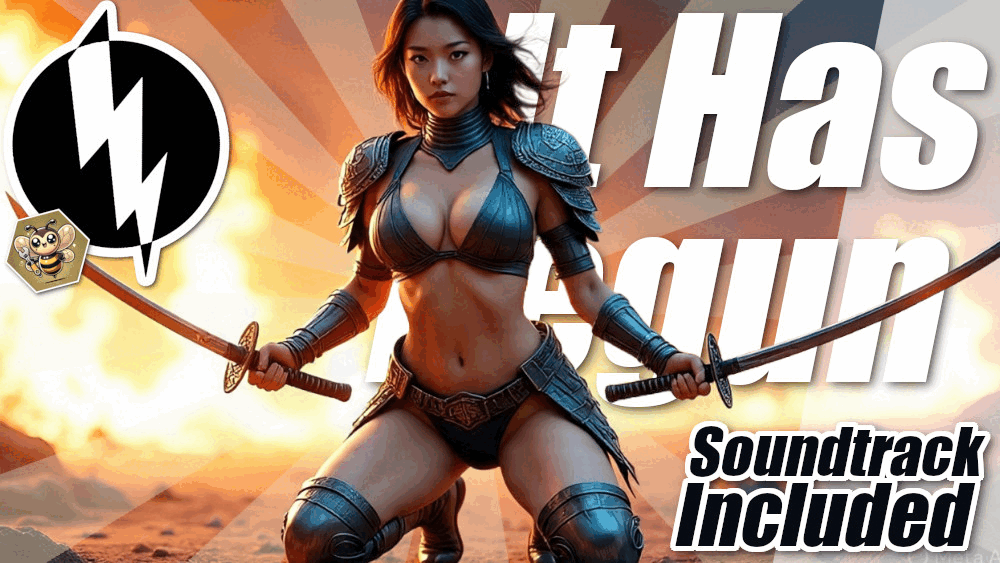
• @powerpaul | [ENG/DEU] It Has Begun! After More Than Seven Years, It Has Finally Happened... Downvotes!
• @powerpaul | [ENG/DEU] Rahi Really Triggered Me So Bad! | In the Next Life, Will I Do ... Something Else?
• @cryptocompany | [ENG/DEU] Your Daily Report, Raffle, CCD Repurchase & Burn
• @yourfairy | 34 Raffles, Sweepstakes & Promotions + Own Photo Contest: Prompt "What does luck mean to you?"
• @powerpaul | [ENG/DEU] I Sometimes Use Clickbait, but Not Now! THIS is One of the BEST EXPERIENCES ON OUR BLOCKCH...
• @yourfairy | 36 Raffles, Sweepstakes & Promotions + Own Photo Contest: Prompt "What does luck mean to you?"
• @cryptocompany | [ENG/DEU] Your Daily Report, Raffle, CCD Repurchase & Burn
Your old cover images were kid-friendly!
Now, it is no longer the case!
When I work on the laptop and my 7-year-old boy comes to me, I hide/close the tab!
So, all okay!
!BBH
Hmmmm, okay. Well... I only can understand this, when I include that different cultures have different culture or views about which amount of skin on a woman is okay and what not. I get it. I am not 100% sure in which culture you live - and it doesn't matter that in my culture where I was born this amount of skin is 100% not a deal. For you it may be different and that matters. For me these are common pictures you can see in every swimming pool, the beach or in common lifestyle or fashion magazines... But yes, I understand that in some spaces this might be, dependent on the culture, to much.
The bigger thing - and this is really not good I think (but doesn't stop me from marketing with these materials) - that it transports an unrealistic image oh how women look like. Because yes, in the past there were photoshopped images (on the top models too) in lifestyle magazines and the mob (or at least the people who knew about) hated it already. Because it's not fair - and nobody told you "Hey even the top models are photo edited". But this AI stuff kicks in even harder... I get it...
Thank you very much for your feedback! Always good to enhance the own perspective!
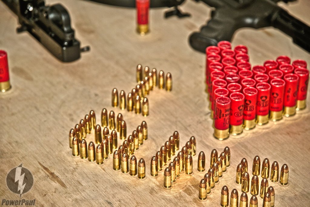
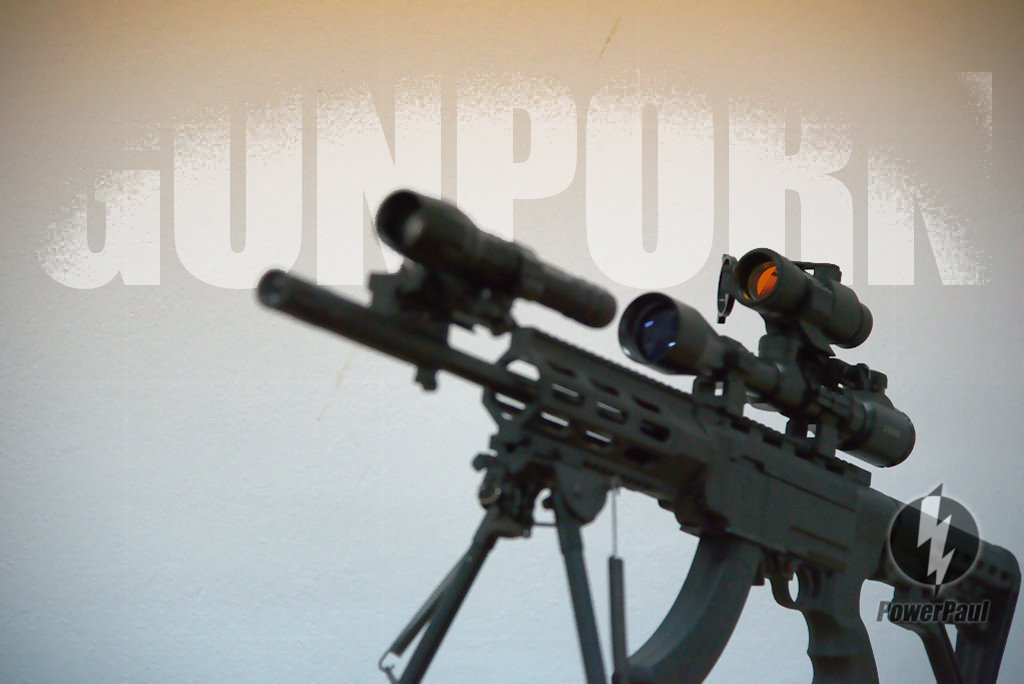
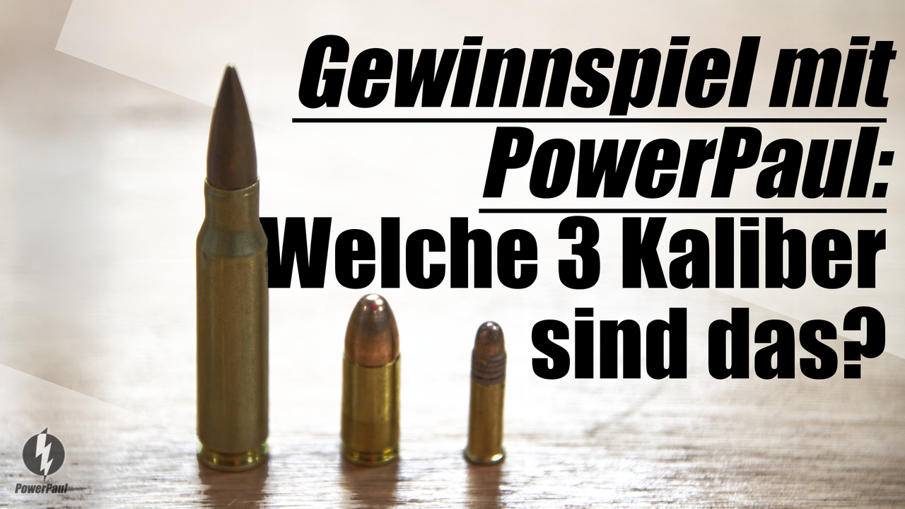
Calibers from right to left: .22LR, 9mm, 7.62x39mm
!LOLZ
lolztoken.com
Because his paint was running.
Credit: reddit
@powerpaul, I sent you an $LOLZ on behalf of servelle
(3/10)
Delegate Hive Tokens to Farm $LOLZ and earn 110% Rewards. Learn more.
Servelle! You surprise me! Not bad! Not 100% correct, but very close. I assume you would know the alternative to a 7.62x39mm... 7.62 is right, but... it's not a Russian thing in my case ;-) It's... Now I am pretty sure you know it...
Respect!
Guys, !lol look at this girl! Caramba!
lolztoken.com
Listen buddy, i'm going to be frank with you.
Credit: reddit
@servelle, I sent you an $LOLZ on behalf of powerpaul
(1/6)
NEW: Join LOLZ's Daily Earn and Burn Contest and win $LOLZ
AhAh I use to play some war games (Jagged Alliance in particular) the alternative is 7.62 NATO maybe
!LOLZ
!PIMP
lolztoken.com
Because they are so good at it.
Credit: reddit
@powerpaul, I sent you an $LOLZ on behalf of servelle
(1/10)
Farm LOLZ tokens when you Delegate Hive or Hive Tokens.
Click to delegate: 10 - 20 - 50 - 100 HP
!lol Well it's .308 WIN. But... well... (Now the inner nerd is awakening:) It is kind of the same, but not identical. The dimensions are the same. .308 WIN has more pressure, thicker walls of the casing and has less tolerance of the bullet compared to 7.62 NATO. Means .308 WIN is more used for civil sport shooting or hunting, 7.62 NATO is prefered in rough military usage. In modern rifles you could interchange them. (Not sure about what it would do to the grooves of a precision rifle when you use significant weaker amunition or amunition flies "a little loose" in the barrel... Because the grooves, the barrel and the caliber/pressure are well coordinated... Not sure about how this affects the spin too. Obvious, I think, not for the better. But all in all 7.62 NATO is less precise. Unrelated if shot from a .308 WIN rifle or a 7.62 NATO rifle) And even if the caliber is "the same", older military riffles maybe don't like .308 WIN, because of the higher pressure of a .308 WIN.
But all in all: well done! Really good!
lolztoken.com
Close the door, I am dressing.
Credit: reddit
@servelle, I sent you an $LOLZ on behalf of powerpaul
(2/6)
Delegate Hive Tokens to Farm $LOLZ and earn 110% Rewards. Learn more.
Thanks for all the details, unfortunately I don't have much experience with firearms except for an old 7.65mm semi-automatic rifle and a 9mm submachine gun during my military service. Long time ago 😅
!LOLZ
!BBH
lolztoken.com
But the lady behind the counter keeps putting it back.
Credit: marshmellowman
@powerpaul, I sent you an $LOLZ on behalf of servelle
(5/10)
Farm LOLZ tokens when you Delegate Hive or Hive Tokens.
Click to delegate: 10 - 20 - 50 - 100 HP
Well, the choice and knowledge of the words semi-automatic and submachine makes you much more educated about guns than I would expect from the most Germans.
Servelle, you rock! !BEER
Nice work! You put a lot of effort into this post! The bullets image is really kind of cool!
Thank you very much! Oh, I made so many gun and ammo photos... I really had fun with it combining two things I liked: guns and photography... I made a lot of awesome pics...
Thank you once again! !BEER
I learn that your AI can only put 3 babes max, you need to get a new AI that can draw 4 babes
Nooooo... My images aren't wide enough... But lastly I prefer less persons on the pic. Because with every person more which should do something, the prompt becomes more and more complicated = more mess. Not only related to the persons, but what they should do too... Aaaaand sometimes the persons look veeery similar... I prefer 1 to 3... Better 1.
!lol Great answer! Hive a great day!
lolztoken.com
You use a pumpkin patch.
Credit: reddit
@dewabrata, I sent you an $LOLZ on behalf of powerpaul
(2/6)
Delegate Hive Tokens to Farm $LOLZ and earn 110% Rewards. Learn more.
Hi, I hope your leg is feeling better.
Regarding the images, thanks for showing your evolution, but I think that both the images and the contents, depend on the gutao of each person who creates contents.
Since tastes are subjective, and what is good for some, may not be good for others.
Happy day.
Este post fue votado desde Ecency.
!HUESO
!LUV
I 100% agree. And my content is controversial. Sometimes. In the past even more. You can assume so when you see the selection of images where I included guns... Some hated these articles, some loved them... And some think I am stupid of have a simple brain... !lol And I assume with the actual image style it's kind of similar...
But right now (or better said a few minutes ago when I took myseld a little free time) I created something where I don't know how to include a girl into this topic. It just wouldn't fit... Hmmm... And I have no idea in general how I want to design image content for this topic... So, I think a posting is coming without a girl on the cover...
lolztoken.com
Chase it around the block.
Credit: reddit
@osomar357, I sent you an $LOLZ on behalf of powerpaul
(3/6)
Delegate Hive Tokens to Farm $LOLZ and earn 110% Rewards. Learn more.
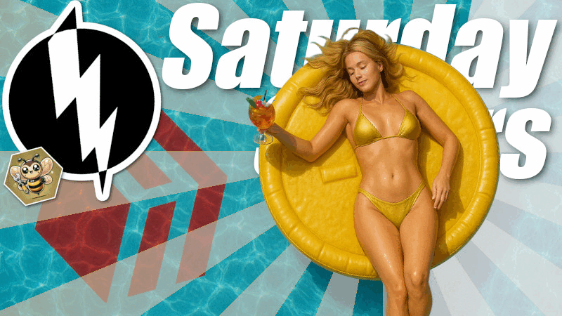
God made women with some perception in his head, the way women make even pencil look hot or even lemondae glass look attractive is gods work. And yeah your images are getting better from all these progress. That saturday saver image with bee was kind of attractive click worthy. Have a good week ahead, Paul!
!lol You said something I never discovered... On the Saturday Saver image... there was just a cute bee! lol...
Thank you for your good wishes & your comment!
You too! Hiva a great week!
lolztoken.com
Then they call me ugly and poor.
Credit: lofone
@datastat, I sent you an $LOLZ on behalf of powerpaul
(1/6)
NEW: Join LOLZ's Daily Earn and Burn Contest and win $LOLZ
The quality of our posts is linked to the time we dedicate. Lately, I've barely had time to breathe, trying to coexist with Hive and stay focused.
In the short time I've been following you, the changes and improvements in the quality of your posts and the innovations you've introduced are evident, further reinforcing the idea that quality is linked to time. You dedicate a large portion of your time to learning, a valuable thing that rewards us with new things.
!BEER
I think images are the key to getting people to say, "Wow, there's something I want to see there," and then they click through to the posts. It's very important to dedicate time to it.
@powerpaul, I paid out 0.638 HIVE and 0.125 HBD to reward 8 comments in this discussion thread.