Arte urbano en la parada del colectivo / Urban art at the bus stop
En un día de paseo, decidimos tomar el colectivo para Adrogué en la parada cerca de casa. Teníamos tiempo sin ir por esa zona, pues vamos en sentido contrario, por eso cuando llegamos a la parada, mi sorpresa al ver este mural fue realmente muy grata.
Mi último recuerdo de ese lugar era ver la pared lateral de un kiosko que funciona ahí, la cual estaba sin pintura y tampoco frisada, eran solamente bloques colocados, sin ninguna gracia, para cerrar el espacio. Ahora, con este diseño urbano, la espera del colectivo se hace más grata, pues brinda la posibilidad de entretenerse con los detalles que puedes encontrar en el.
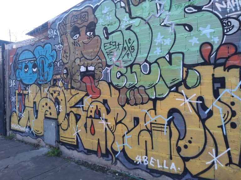
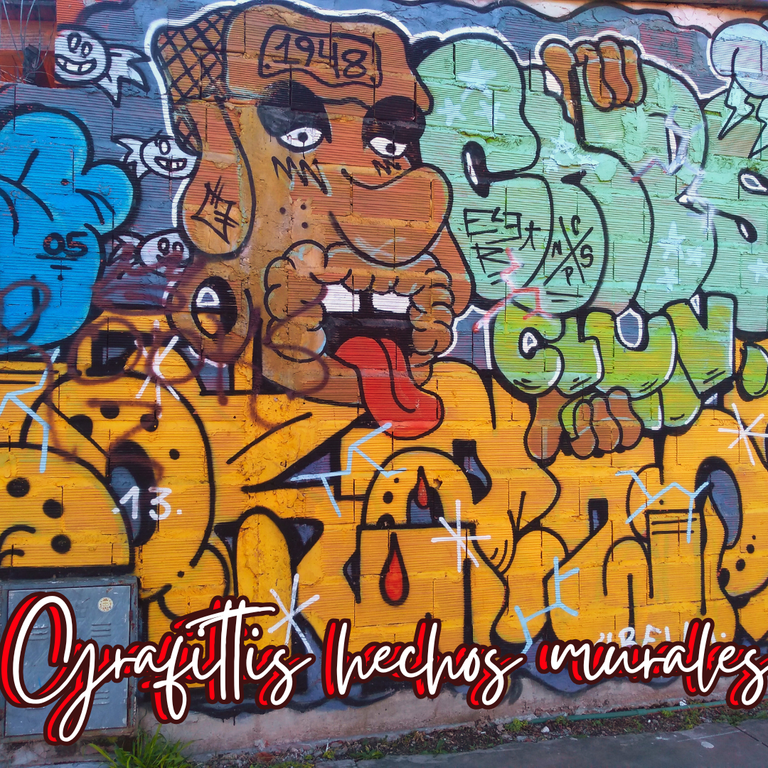
Aunque parece un grafiti por el estilo de las imágenes, fue hecho con pinturas de diferentes colores, destacando el amarillo por el tamaño de las letras, pero también el azul y el marrón de las figuras humanas, lo cual puede tener un significado más allá del color de piel normal de las personas.
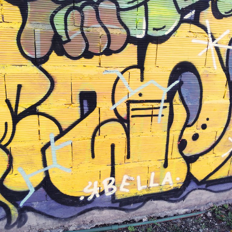
El diseño está compuesto por dos figuras humanas y varias filas de letras, algunas de las cuales no se entienden, pero van enlazadas a modo de escritura.
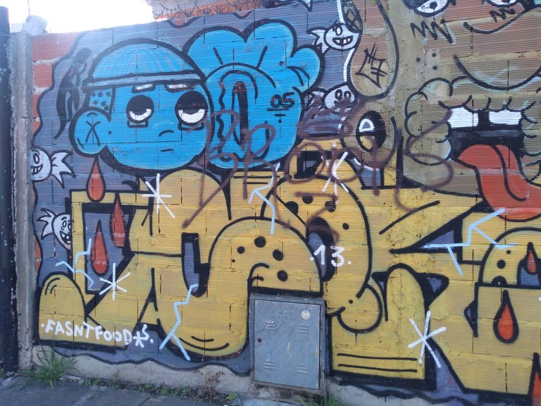
La figura azul tiene una expresión triste, pareciera que justo refleja con el color la tristeza del niño, aunque también pudiera ser la expresión de alguien que vive en un mundo azul. En tanto, la otra figura representa un hombre mayor, quizás el número en su cabeza sea del año de nacimiento, como para que saquemos la cuenta de cuantos años pudiera representar.
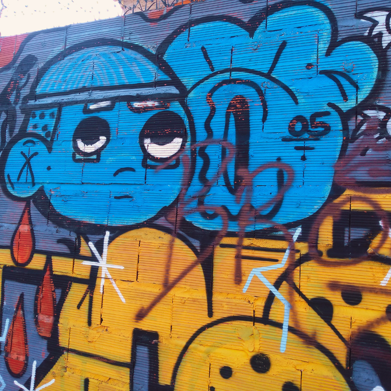
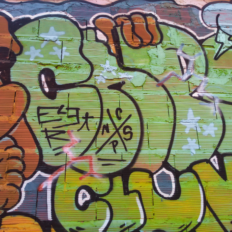
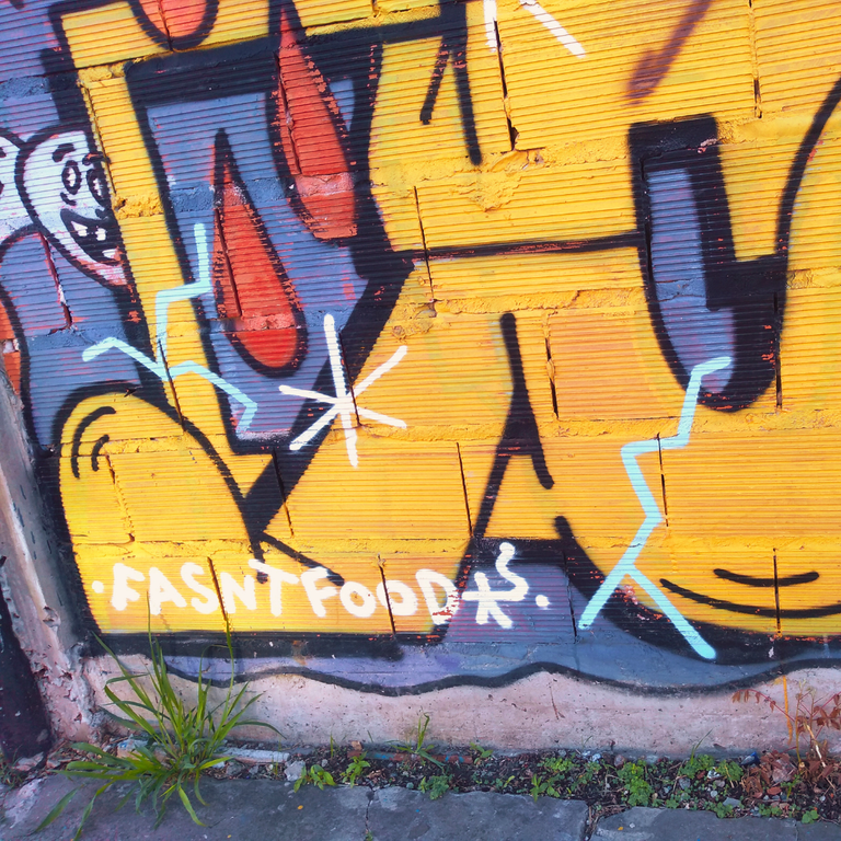
Unas especies de caramelos con rostros sonrientes, me dan a pensar que más que dulces son pirañas, o la expresión de golosinas que son nocivas para los niños. Además de líneas entrecruzadas en formas de estrellas simples, que le dan el efecto de brillos en todo el diseño.
La presencia de un patrón de 3 gotas rojas en los extremos y también en el medio del diseño, es algo que pareciera sangre, pero realmente no le consigo conexión con el resto del dibujo. Lo único que rescato de su presencia, es el aporte del contraste entre los colores claros con el rojo, lo cual le da profundidad.
Fue una experiencia bonita poder detallar este diseño mientras esperaba el colectivo, el cual por suerte se tardó lo suficiente como para fotografiarlo y disfrutar de sus detalles en persona.
On a day of walking, we decided to take the bus to Adrogué at the bus stop near our house. We hadn't been in that area for a long time, because we go in the opposite direction, so when we arrived at the stop, my surprise when I saw this mural was really very pleasant.
My last memory of that place was to see the side wall of a kiosk that works there, which was unpainted and without friezes, they were just blocks placed, without any grace, to close the space. Now, with this urban design, the wait for the collective is more pleasant, because it offers the possibility of being entertained with the details that you can find in it.
Although it looks like graffiti because of the style of the images, it was made with paints of different colors, highlighting the yellow for the size of the letters, but also the blue and brown of the human figures, which may have a meaning beyond the normal skin color of people.
The design is composed of two human figures and several rows of letters, some of which are not understood, but are linked in the manner of writing.
The blue figure has a sad expression, it seems that it just reflects with the color the sadness of the child, although it could also be the expression of someone who lives in a blue world. Meanwhile, the other figure represents an older man, perhaps the number on his head is the year of birth, so that we can count how many years he could represent.
Some kind of candies with smiling faces, make me think that more than candies they are piranhas, or the expression of candies that are harmful to children. In addition to crisscrossing lines in the form of simple stars, which give the effect of glitter throughout the design.
The presence of a pattern of 3 red drops at the ends and also in the middle of the design, is something that looks like blood, but I do not really get connection with the rest of the drawing. The only thing that I can rescue from its presence, is the contribution of the contrast between the light colors with the red, which gives it depth.
It was a nice experience to be able to detail this design while waiting for the bus, which fortunately took long enough to photograph it and enjoy its details in person.
Foto/Photo by: @mamaemigrante
Edición/Edited by @mamaemigrante using canva
Translated and formatted with Deepl
Posted Using INLEO
Contáctenos para saber más del proyecto a nuestro servidor de Discord.
Si deseas delegar HP al proyecto: Delegue 5 HP - Delegue 10 HP - Delegue 20 HP - Delegue 30 HP - Delegue 50 HP - Delegue 100 HP.
Gracias por el apoyo.
@tipu curate 8
Upvoted 👌 (Mana: 0/70) Liquid rewards.