Countess Sinash Splinterlands Weekly Art Contest Entry

Hello, how are you? Time flies really fast, and I don’t know if I am happy about it, Lol. Sometimes when I draw something, ten minutes feels like an hour for me. And I remembered when the months started, the days ran faster that night, so I think that makes sense. I am now in my era again of being a night owl, can’t process my brain in daytime.
So for my entry for this week, I chose Countess Sinash because I like the confidence on her face, and I like the vibe of it, one of my criteria in choosing my character is confidence. So yeah, I think my week break is working right now, I don’t hate myself anymore hahaha.
The Process:

For the line art, one thing that I always do is just simple, that’s it, making complicated line art is still in progress for me, considering my gear, I guess when I will soon upgrade it. I used my usual brush when it comes to sketch and line art. I used the marker detail brush, which is the go-to brush of all time.

After that, I am going to add the base color of the character. What I do is I make sure every part of the character has its own layer, which helps me to render more easily, just by clipping that layer, and it does its job. And I used the shape fill tool brush to add the base color. What I do is I just drag the brush to the shape of the character, and it will fill up for you. Saves me a lot of time, actually.

Next, for this part of the process, I still use the shape fill tool brush to add the base shadows and highlights. I just filled in the part that is in shadow, highlighted the area, and am done. I like doing it, it makes it easier to see where the part is that I need to render.
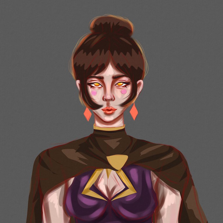
Next, I added texture to the canvas, just my usual thing to do since I discovered it, and I can’t stop doing it, so it has been my ritual since then. And then I blurred the part where I added the shadows and highlighted what I do is I used this blur filter called Gaussian Blur, a great filter that saves me a lot of time and makes my life easier, and I will not manually blur the part anymore.

For this part of the process, what I did was add more intense layer shadows and highlights, and added more contrast and shades to the character, and I built the details little by little in the meantime.

For this part of the process, what I do is I start background design. What I do is I add her power behind her more, bigger, lighter, and the idea is just simple. I added a layer of details on her, and it looks better and better as the progress goes on. I completely turn down the opacity of the line art because I am not independent of it.
For the final part of the process, I finish the background design, making the background darker. I think that works when I wanted the subject to be the center of attention, so I like it. And then I added intense highlights on her to make it more dimensional to look at. Finish it with my signature, it is a sign that my art is done.
Original Character

Thank you for visiting. See you on my next blog. :D
Please take care of your mental health as well.
I hope you are okay today :))
Materials:
Gear: XP-Pen Deco 1 v2
Program: Krita
Duration: 5 hours

The fire effect is 👏👏👏🔥 nice seeing you participating! 😊 Best of luck! 😊
Thanks for sharing! - @cieliss
