Tips for Effective Marketing
"Marketing" may immediately make you cringe, but it doesn't have to be evil. One of my jobs at the library is creating promotional materials for programs and events. My goal is just to ensure people are aware of them. In this post, I intend to share the principles I have learned.
Of course, the easiest option is to edit a preconstructed template. They often have passable layouts, typefaces, color schemes, and so forth, but finding something which suits your needs can be a challenge. If you need to create an advertisement or handout from scratch, here's how to do it yourself!
Created in Canva
Images
Good graphics catch the eye. A lost dog flyer needs a photo of the missing mutt. A concert poster needs a picture of the band. An ad for a new product needs to show the product! If you don't have a photo of your own, you might find yourself risking legal trouble thanks to copyright laws. I suggest using sites like Pixabay, Unsplash, or Pexels to find royalty-free photos or illustrations under permissive licenses to serve any stock photo needs.
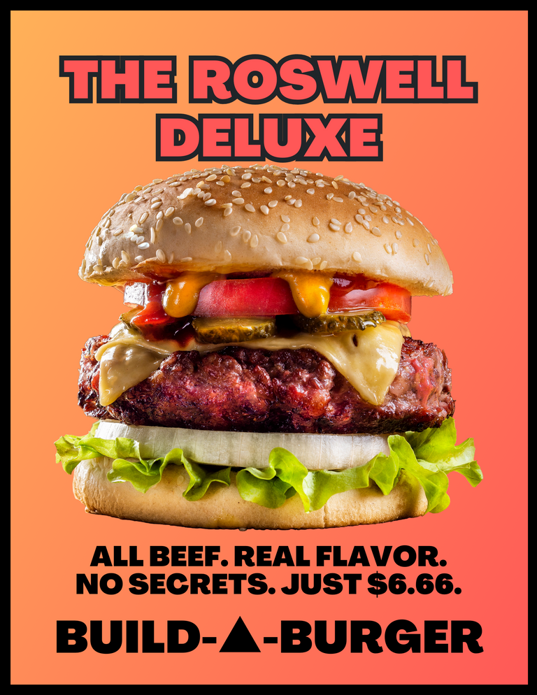
I designed this advertisement poster for my unexpectedly-useful fictional fast-food franchise with a cheeseburger image from the Canva clipart library because the emphasis is on the food. The yellow/orange background is mainly because my real-world national brand competitors also have yellow and red as their corporate colors.
Text
When your goal is getting attention and communicating information quickly, you need to carefully consider your text. Clear, concise posters should be both legible and aesthetically pleasing.
Ideally, use two fonts, and no more than three. A different size or color counts as a separate font. It can be effective to combine a bold font with a narrow font, or a serif font with sans-serif, to create added contrast.
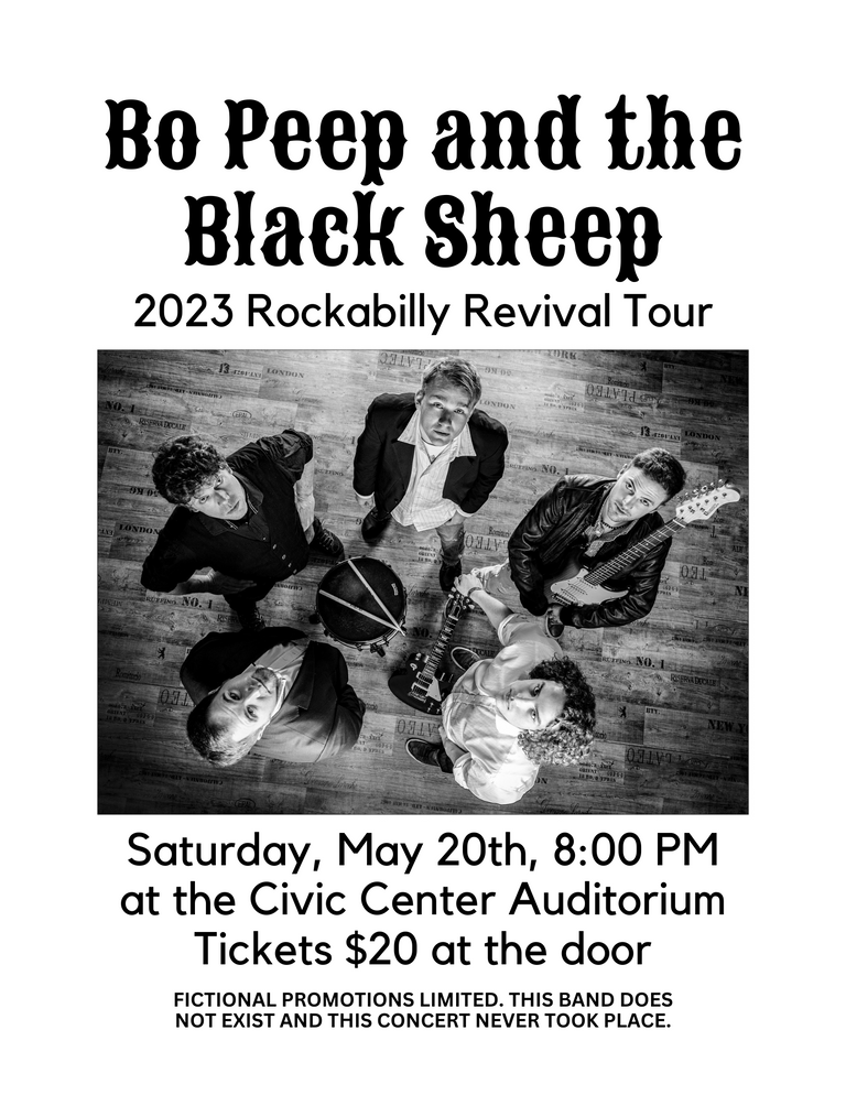
In the burger poster above, text is minimal. I used only one typeface in two versions, plus the wordmark branding at the bottom, as if that one font was key to brand identity. In the band poster below, I used a fancy typeface for the band name and then simple sans serif text everywhere else.
Canva offers a useful guide, and Fontjoy has a fun tool to mix and match typefaces for title and body text. Just don't use Comic Sans, Papyrus, or handwriting/brush scripts unless you are absolutely certain you are using them properly. And then don't use them anyway because you're still wrong.
Created in Canva with an image from Pixabay
Content
Who, what, when, where, why, and how are the core facts you need to communicate, whether you are writing an in-depth investigative journalism exposé or designing a simple flyer.
In this music poster, you can see who is performing, what style of music to expect, where and when it will occur, and how to get a ticket. Why you might attend is up to you.
Layout
Once you have your core image and text, layout is the next consideration. Would a straightforward layout or dynamic angular design fit your theme? Do you want a full-color poster or a simple black-and-white document? You can print the latter on colorful paper to still be more eye-catching while saving money per page.
Software
Online tools like Canva include a lot of stock photos even for a free account, and the text editor and layering tools are good. Most office suites include a program designed for flyers and handouts, including Microsoft Publisher or LibreOffice Draw. For those who like full control, Adobe Photoshop or GIMP have you covered.
Final Thoughts
Please forgive the hastily-created example posters. Did I miss anything important in these brief points? All of these are guidelines and starting points for you to consider, but they exist for good reason. If rules were made to be broken, understanding why they exist will allow you to break them constructively. Otherwise, you risk a mess that makes Web 1.0 personal sites look restrained in comparison.

Congratulations @jacobtothe! You have completed the following achievement on the Hive blockchain And have been rewarded with New badge(s)
You can view your badges on your board and compare yourself to others in the Ranking
If you no longer want to receive notifications, reply to this comment with the word
STOPCheck out our last posts:
I ONLY hear the great Bill Hicks and his classic rant on marketing when the term is used. It made such an initial impression on me that it has stuck in my craw forever. It's most likely had an impact on my earnings....
It's that exact bit I was thinking about in my intro sentence.
Hey, leave my geocities page out of this!
Marketing isn't evil, it's a tool, like a firearm. Where I grew up bragging was viewed as evidence that you were full of shit, I've never been able to shake the feeling that marketing was just a more polished form of bragging. I understand why you do it, I just have trouble bringing myself to do it.
As you can imagine, I don't have anything relevant to add to the topic at hand but you reminded me of a half baked rant that I've been punting on. Short version: Ever stop and think about how much human effort goes into what is essentially an attempt at manipulation used in lieu of people thinking for themselves?
Good marketing: "Hey, here's a thing that might improve your life, and why we think it's worthwhile for you to try." Honest, but not always effective at piercing through the hubbub of modern life.
Bad marketing: "This thing is so totally awesome you will have all the sex you can imagine with attractive people." Bad, but often effective.
Evil marketing: "If you don't buy this, you're a bad person who kicks puppies. Spend money with us to prove otherwise!" Also often effective.
And I was specifically looking at some archived geocities pages while considering whether to include an illustration. :D
Good tips for a necessary evil!! It's amazing how people forget the basics such as having the thing you are marketing on the actual poster/flyer and the like
Some marketeering wankers seem to manage the art of advertising a brand with apparently random unrelated imagery. I don't play that game.
Roaring waterfalls
A sports car racing down a twisty mountain road
A lionfish swimming in the ocean
A business meeting between people who are all far more glamorous than any group of executives I have ever met
Screen fades to black as string quartet reaches a crescendo, and the brand appears...
Hostess Twinkies
YEah, I have saw some horror shows. Actually there was one in my work that was quite hilarious where they had someone swinging on a rope but the way they filmed it with the models plastic grimace the angle made it look like the person was being hung. It made us laugh :OD
Business as it is today is running only because of marketing and publicity, otherwise there are so many shops opening nowadays that it is very difficult to start a new business.
I was really looking forward to that concert! Dratted fine print. HA HA!