Mix of Photos
It's time for another photo practice as I'm not sure when the last one was. I've been taking photos here and there, hoping to take a few good ones I can post. My plan was to focus on architecture and black and white, but most likely that's going to happen this week, in the upcoming days.
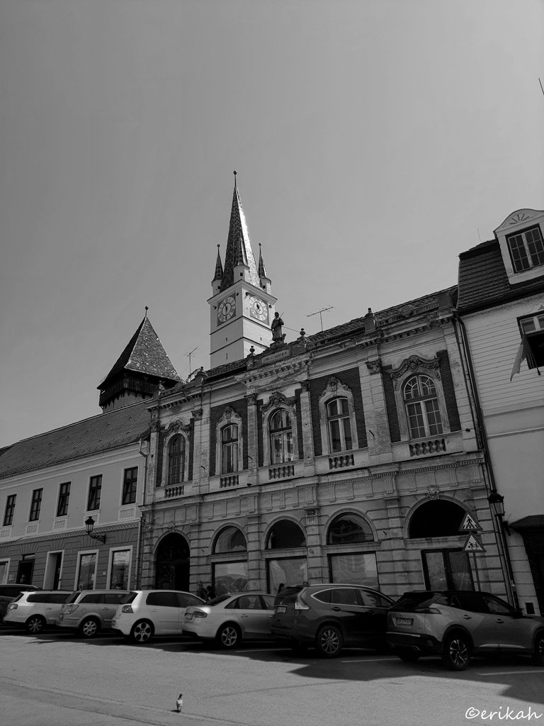
Let's start with some good old monochromes as architecture looks better in black and white in my opinion and I'm not the only one. When you take away the colors, the eye focuses on the details.
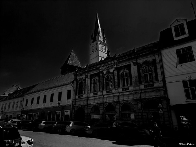
And this is the time when my photo editor starts to play pranks on me.
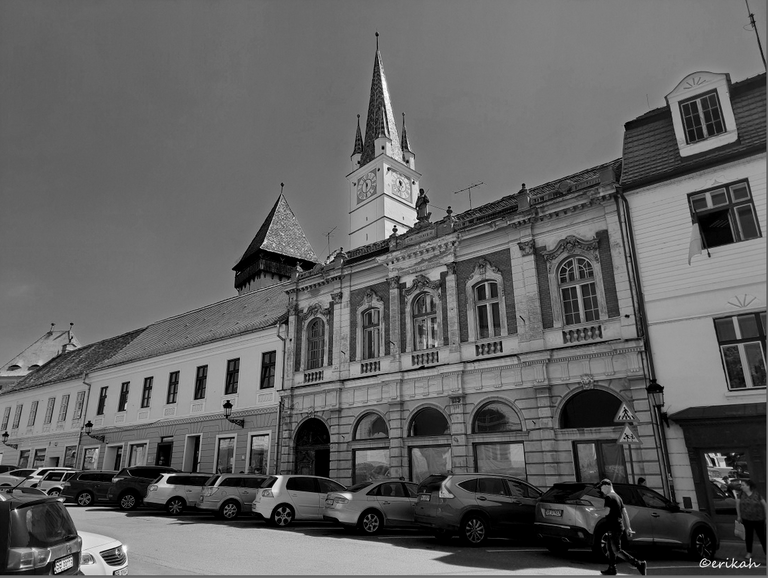
This is the edit I uploaded and below you can see how the photo looked like after uploading.
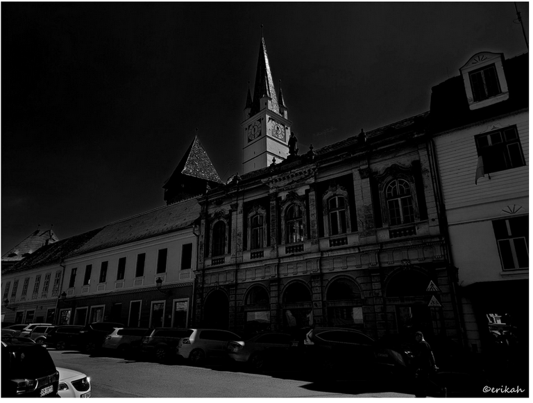
This is just thee draft, so I'm not sure how the photo will look like after posting, but previous experience tells me it's going to be dark. I have no idea why Google Picasa does this, have not been able to figure it out yet.
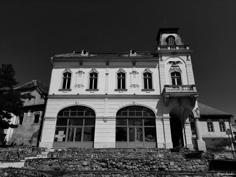
This one is way darker than I wanted to be, but not as bad as the previous one.
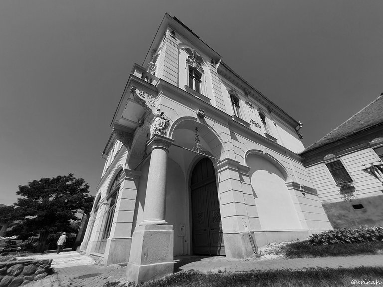
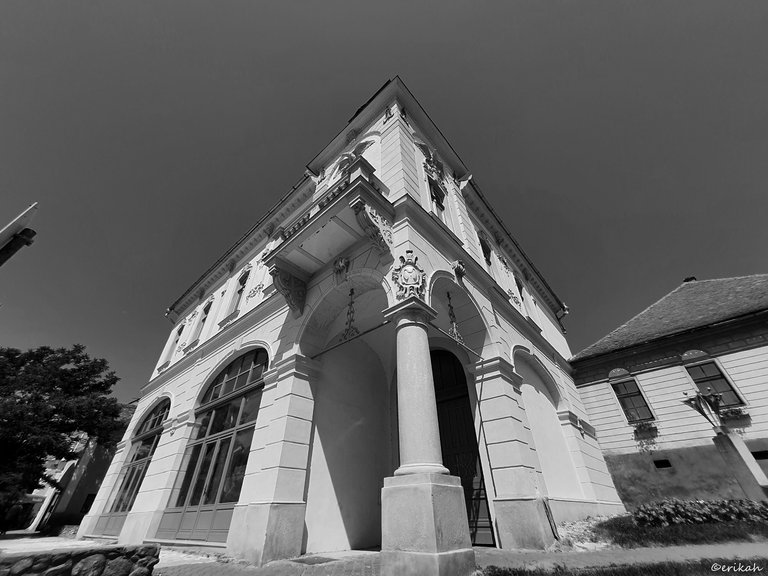
I tried to capture this one from different angles.
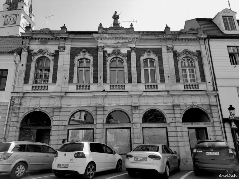
Parked cars are always frustrating, but what can you do, right?
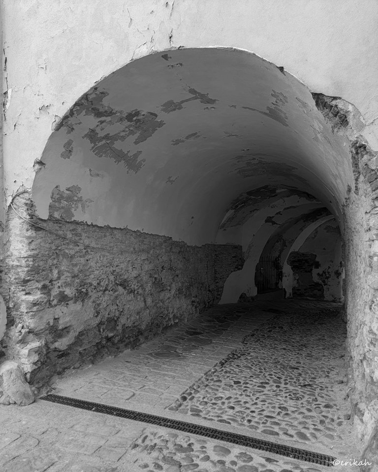
I like this tunnel quite a lot and always try to take photos from different angles.
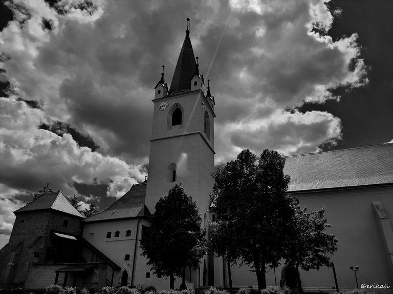
This photo also looks darker in the draft. I'm afraid this post will be a total disaster, but can only find out after posting.
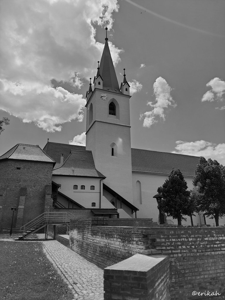
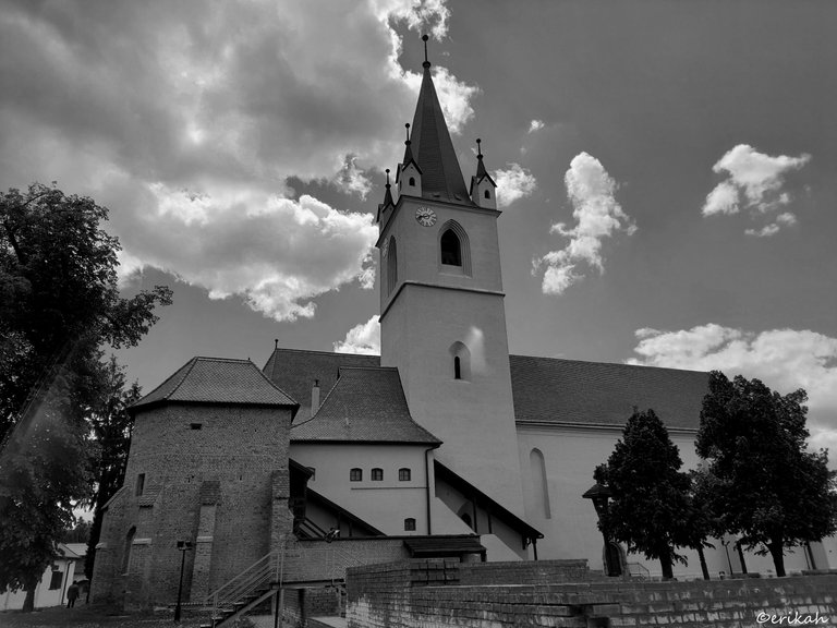
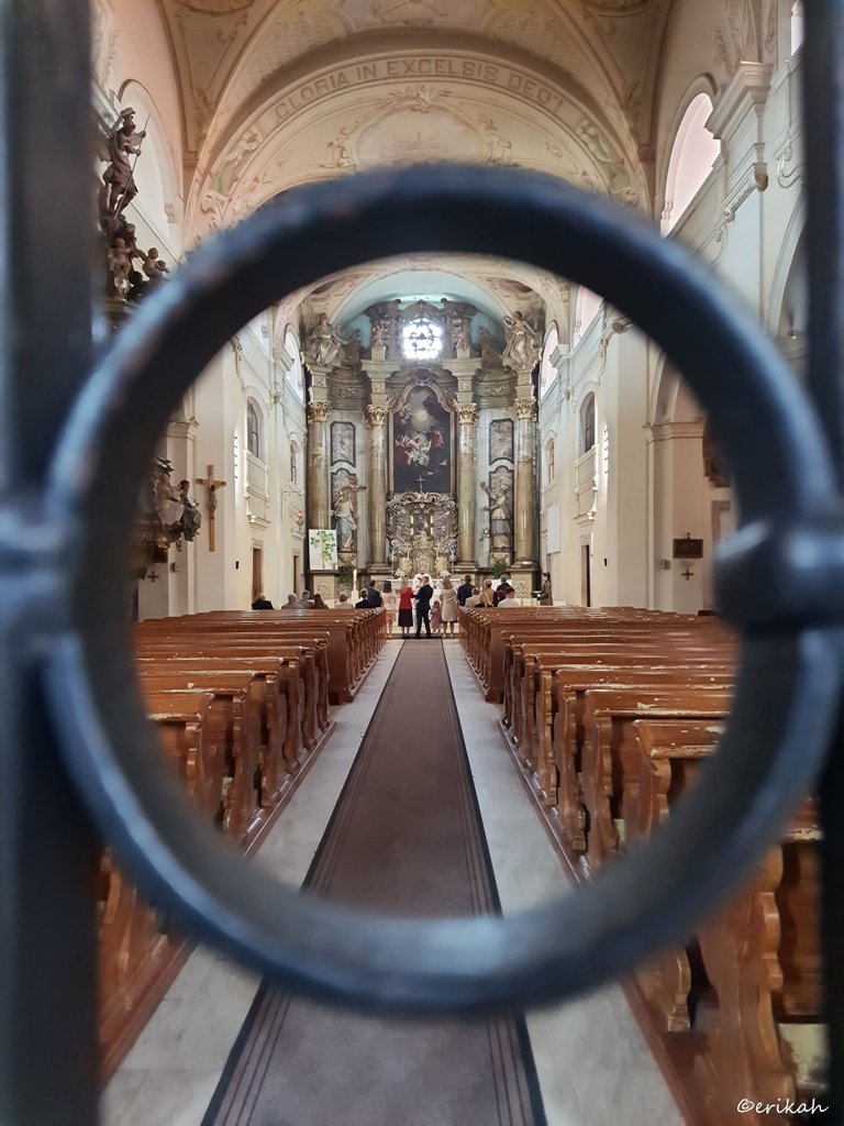
I took this photo in May and wanted to post it, but always forgot. This photo was taken in a catholic church. At the time of my visit, there was a baptizing ceremony going on, therefore the gates were closed, you could only enter the praying area of the church. The iron grid was closed, but I took some photos through it, trying to focus on the altar. I wanted to capture the iron gate too, especially this circle.
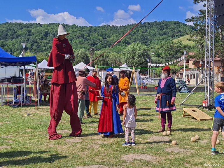
On Sunday I went to a medieval festival, hoping to see some interesting plays, nice music and be part of a good atmosphere, but it wasn't like that. Unfortunately the quality of the festival was not what I expected. I took a few photos, just for fun. This one was funny.
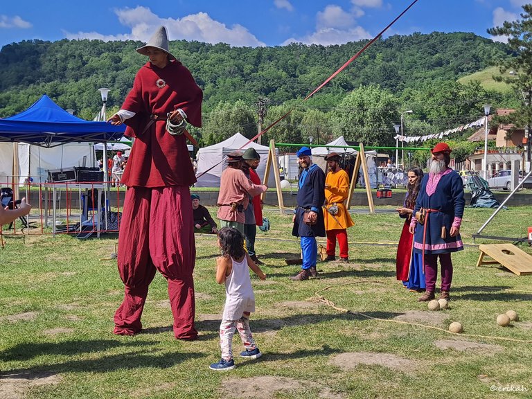
They were preparing to play a medieval game, with balls and that wooden board, but it was for the children.
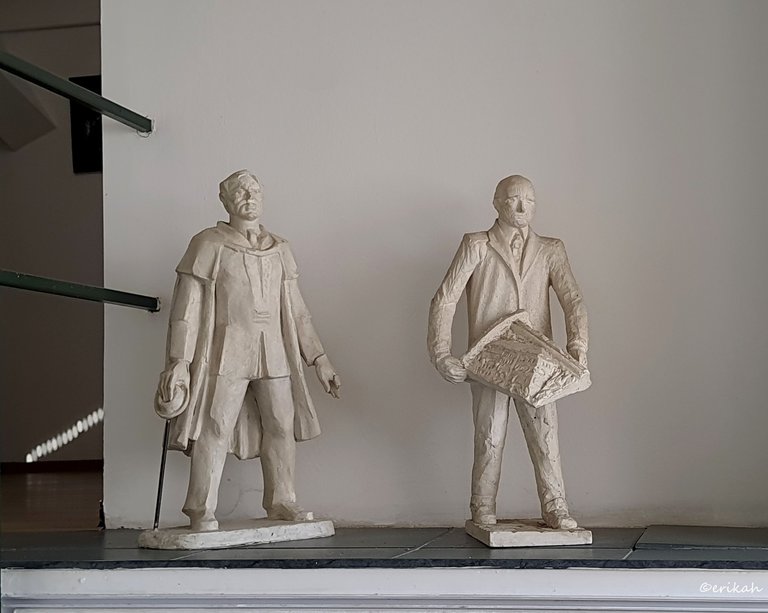
Last, but not least, two statue I photographed at one of the museums I'm visiting often. These were not part of the collection, these statues are permanently exhibited and my purpose was just to practice.
This is it for today. I'm frightened to click on the Publish button as don't know how the photos are going to look but the only way to find out is publishing the post. So fingers crossed. I hope Picasa is done with the pranks as I have work to do and this is not fun.

If you're a newbie, you may want to check out these guides:
- Communities Explained - Newbie Guide
- Cross Posting And Reposting Explained, Using PeakD
- Hive Is Not For Me
- How To Pump Your Reputation Fast - Newbie Guide
- Tips And Tricks & Useful Hive Tools For Newbies
- More Useful Tools On Hive - Newbie Guide
- Community List And Why It Is Important To Post In The Right Community
- Witnesses And Proposals Explained - Newbie Guide
- To Stake, Or Not To Stake - Newbie Guide
- Tags And Tagging - Newbie Guide
- Newbie Expectations And Reality

the best photo I like

Looks like you are not the only one.
Good photos erikah!! i can see how you are improving in your photography skills!! im so proud!
This one was my favorite! good use of framing and lines!
Many thanks @malos10 I really appreciate the nice words. I liked that one too and trying to take more photos like this.
Quite a black humour your editor has 🙂
I agree with the rest on my favourite.
Yeah, it happens from time to time and I hate it. Looks like that photo is the winner here.
Yeah, I can see what you are talking about with how it is darkening some of the photos.
I still say your practice photos are better than my best efforts.😀
The photo of the baptism was my favorite. Although I would have liked to seen this one below without it being darkened or edited. Something about the eagle above the window and the large looming door speaks to me.
I'm going to upload you the original photo tomorrow as I already logged off my laptop. Let's see if you like it better 😏
oh cool, thanks.
Here it is, this is the original photo.
I like the fact I can see the details of the door and eagle better with this one, which is why I was hoping to see it. With the BW one I really didn't even notice the other part of the building to the right. It is much more prominent in this one. Shading really makes a difference for sure in perspective I think. Thank you!
You're welcome. Both have advantages and disadvantages, but I'm glad you like it :)
Architecture plus black and white is a good mix for photographic composition. Best regards !
!discovery 40
I'd say it's the best mix.
Thanks for stopping by and have a nice evening.
👍
This post was shared and voted inside the discord by the curators team of discovery-it
Join our Community and follow our Curation Trail
Discovery-it is also a Witness, vote for us here
Delegate to us for passive income. Check our 80% fee-back Program