Iterative Monochrome Monday
Hi fellow Hiveians,
Today I wanted to focus on one photo specifically and have a few different iterations of black and white manipulation!

Iterative Monochrome Monday
I wanted to switch things up a little bit for this edition of Monochrome Monday!
I've talked a lot about the different algorithms that are built into the GIMP photo editing software. They are really some fantastic things once you get used to them, and then you can tweak them as you need to. Today I wanted to kind of highlight what the 4 different common black and white algorithms that I use regularly are!
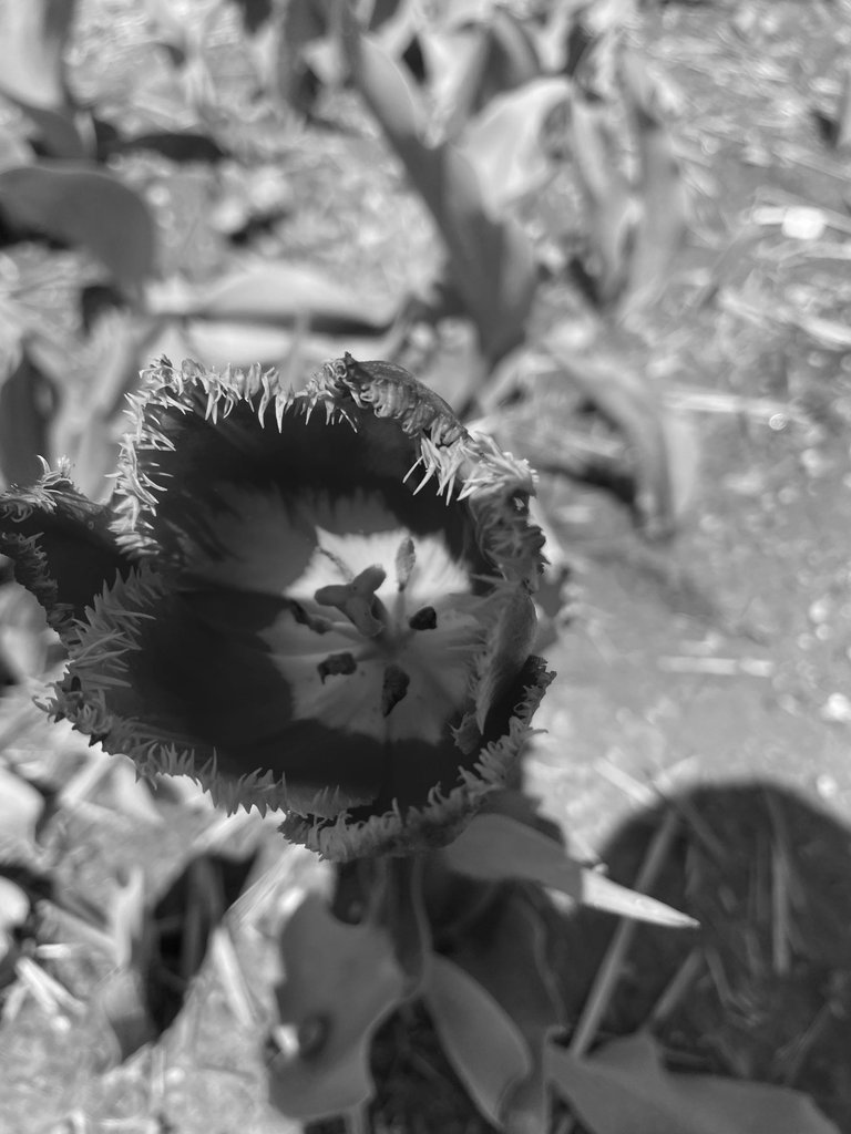
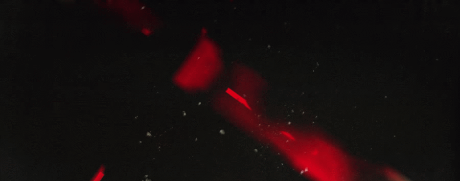
Now it would've made sense if I named the photo which one I used.. lol but apparently I didn't so I will mainly just go on what the image shows. I think the first one for sure here is the most consistent one in terms of color ranges. What I'm really basing this off of is the middle of the flower and how it looks. In each of the photos below, you can tell the algorithm is making different adjustments to it!
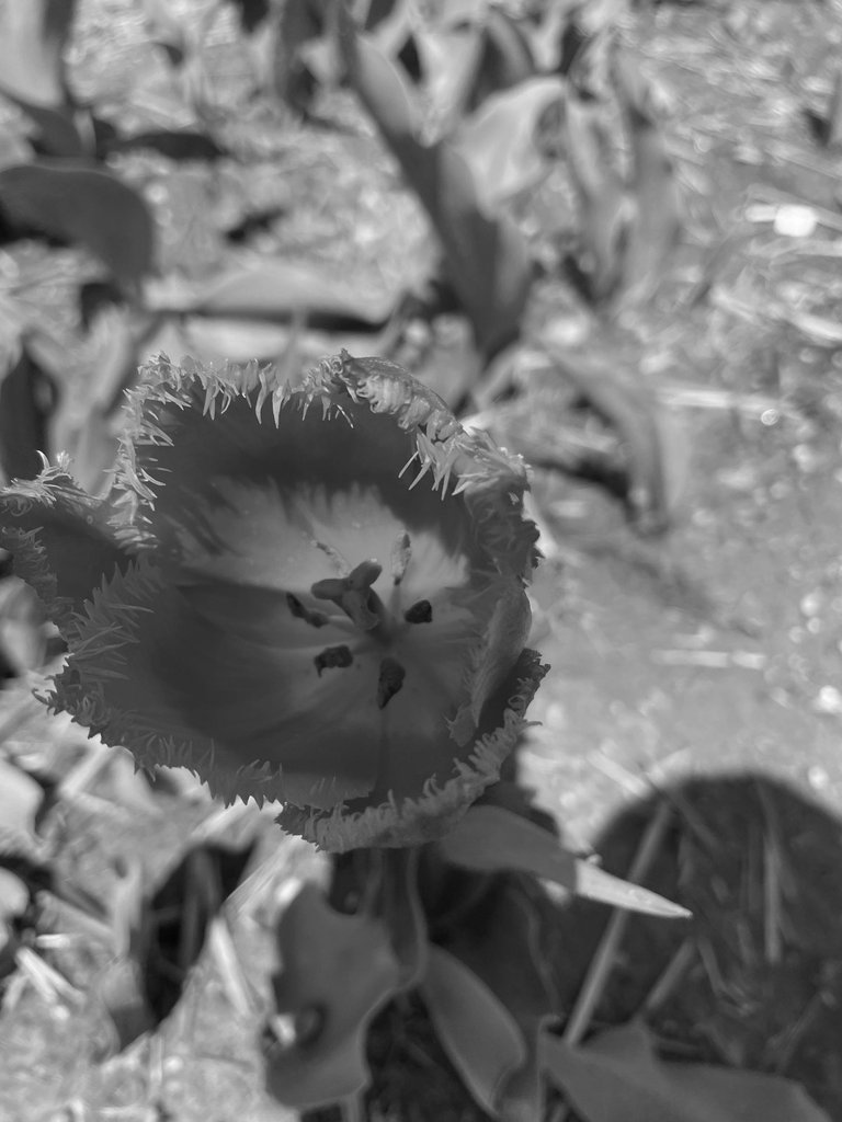
Now this one here is one where you can see the difference compared to the one above. You can see that the sides of the leaf petal are a little bit darker, but there isn't a lot of uniformity as there is in the first photo.
This is one of the reasons that I like to play around with these algorithms a lot! It makes it pretty fun and interesting to see the different iterations that can be generated from the picture I took. I can take one picture and make a few different flavors, each with different strengths! Flowers I sometimes will put on the darker setting, to give it a little more of a subdued look but not always.
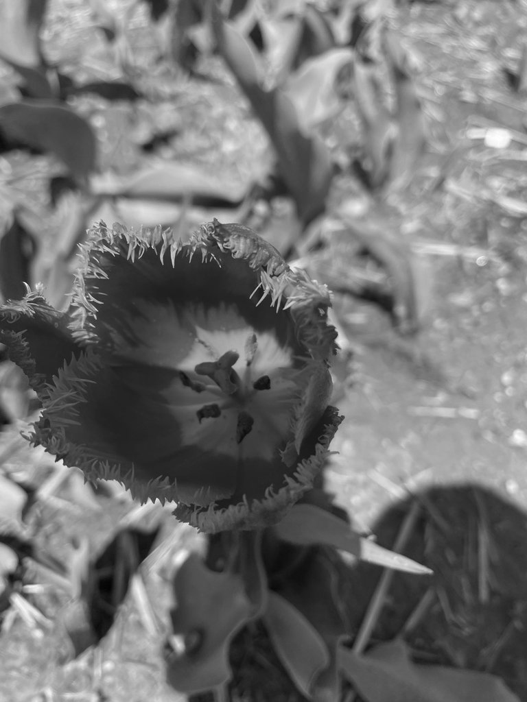
There isn't an incredible difference between this one and the one above it, but you can for sure see that the rim of the inner flower are not as dark and pronounced as it is in the first photo, but it's also still delineating the different color options which is nice.
There can be a bit more investigation into the specific differences but when I am trying to see what type of monochrome picture I am going to transform it into, I try to flip between them and see what looks like it's appealing to me. Some of them I go with the default option but a lot of times I am going with the middle or last one. It depends on the subject I am taking a photo of for sure!
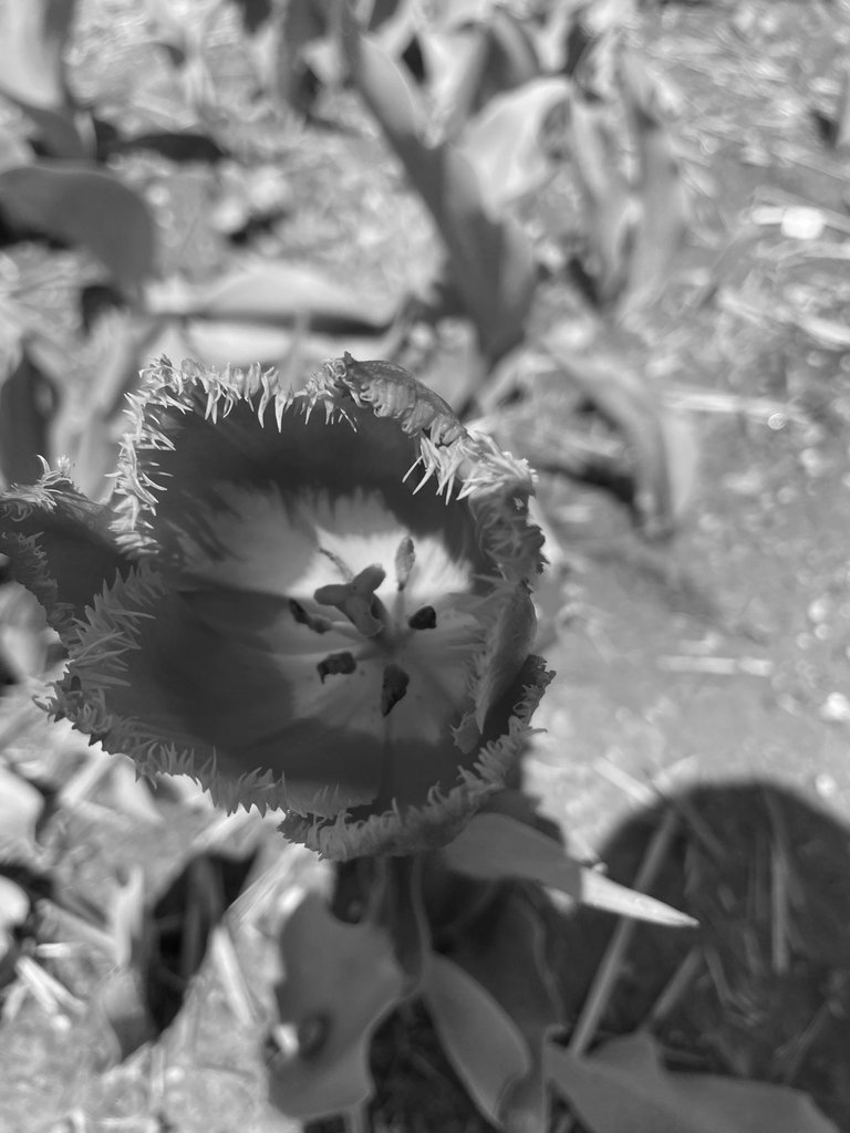
The last one here I believe is one of the ones I use most frequently, especially for flowers. You can really tell the difference between the color shades here which is nice. I think this one is for sure the strongest which is something I enjoy. It doesn't work in all of the situations though! Some situations I actually don't like this one and choose one of the other ones.
For example I've got some photos of the beach where we are at rocks and I am pretty sure I chose the lightest one because this one was just too dark and didn't really work.
I think I've hashed enough of my preferences in terms of the different black and white styles! Which one is your favorite? Let me know in the comments!

-CmplXty. Real human written content, never AI. All pictures are mine unless otherwise stated
Do you want to get paid, in crypto, for searching the internet? Try using and signing up for Presearch to earn some crypto! Join Presearch to break Google's stranglehold on the internet searches.
Nice shot :)
Haha, now my eyes are lying to me, lol. They almost look alike and since I’m not much of a photograph critic, it’s hard! 😂
Butttttt, I’ll go with the last one as my favorite because it doesn’t give ether flower vibe at first glance and I find that really cool.
LOL I'm an amateur myself but I guess I notice it a lot more because I can see the change real-time!
The last one is indeed my favorite as well :D
Hehe, I feel happy knowing the last one is what a pro (you) likes more too. 🫡