Creativity on the move🌿📖 : Logo proposal for the Hive Book Club Community 🚀📚.
𝔊𝔯𝔢𝔢𝔱𝔦𝔫𝔤𝔰 𝔱𝔬 𝔱𝔥𝔢 ℍ𝕀𝕍𝔼 𝔹𝕆𝕆𝕂 ℂ𝕃𝕌𝔹 𝔠𝔬𝔪𝔪𝔲𝔫𝔦𝔱𝔶 🤗🤗

LOGOTYPE PROPOSAL FOR HIVE BOOK CLUB
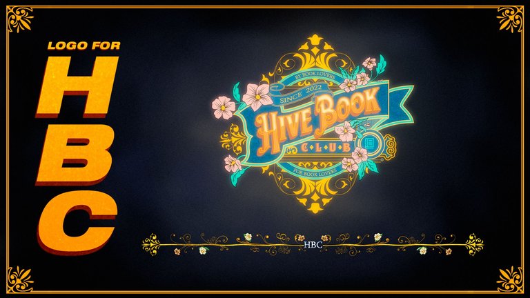
Introduction
Greetings, Hive community! In this post, I will share my logo proposal for Hive Book Club, detailing the creative process and the decisions behind each element for the composition of this work.
Inspiration
In fact, the biggest source of inspiration I had came from each publication of the members of HBC, I spent a whole day observing the activity within the community and together they were forming in my mind the figures in both the logo and the banner, I will explain in each section...
Furthermore, in the course of the mental sketching, I imagined the forms that could be present in communicating the development and creativity of the community.


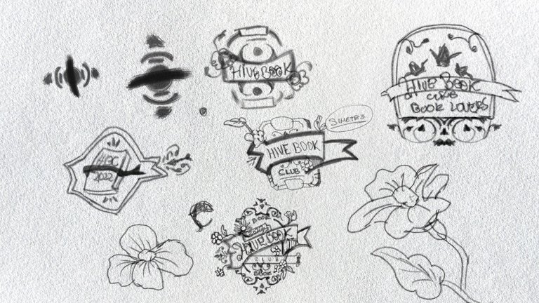
Initial sketches
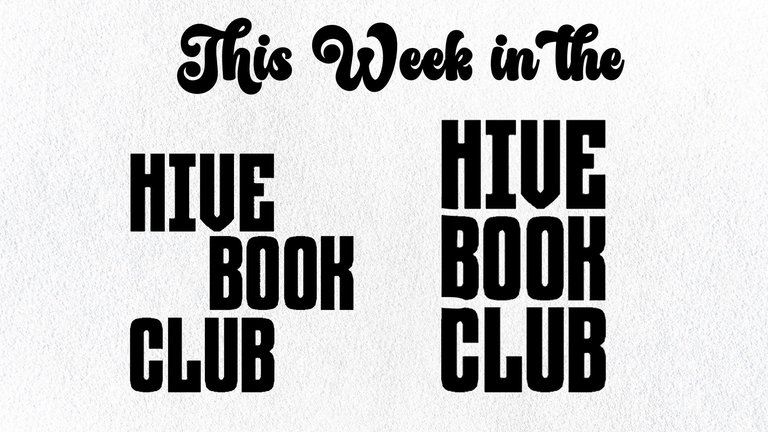 | 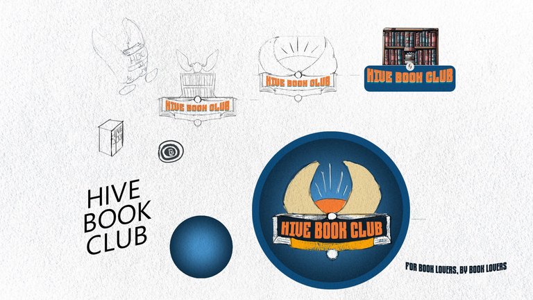 |
|---|
Let's see, who is this logo for, who represents this logo....
Y mientras tenia un dialogo interno, dibuje y dibuje más lo que podría convertirse en mi versión final, sin embargo lo tenía claro pero en mi inconsciente, sentía que no podría ser un típico logo plano , sentía que faltaba algo más...
En eso se me vino el tag line de la marca, la esencia si se podría decir.
by book lovers, for book lovers
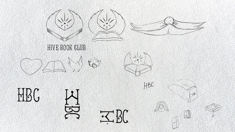 |  |
|---|
I tried to use a decorative typography as a base and from there experiment with various options and even modify it in the passage.
I liked the idea of the book flying but as an illustration or an icon, but I didn't see the value proposition it would deliver to the community.
I would have stopped here, but I went back to the beginning again to sketch from the form and implement another technique and another direction of the concept to generate the logo. Representing a book in a subtle way that surrounds the central text, a portal like the baroque paintings with their ornaments.
I started to use the classic page mark loop to highlight the text even more and to give it its own space within the design... in short; I also decided to incorporate the representation of growth and development and what better than plants for this occasion.
 |
|---|
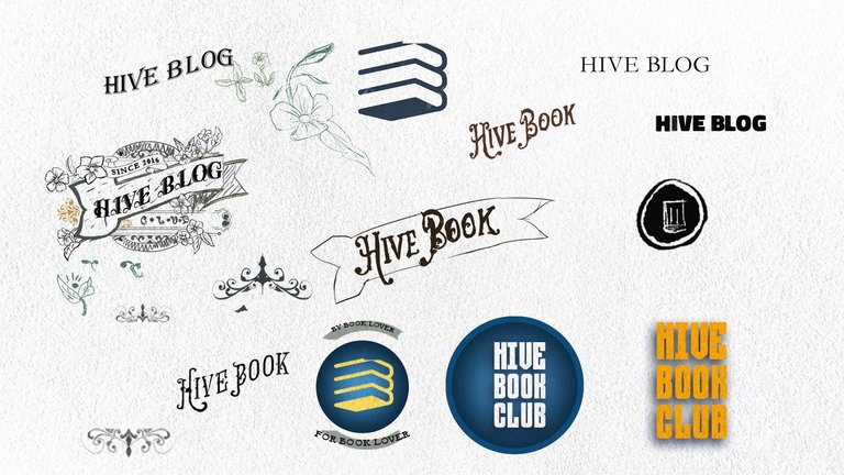
I took the text from HIVE BOOK CLUB and distorted it diagonally, this would make it look more dynamic instead of being centred and justified.
I didn't want something like the previous sketches, I needed a change
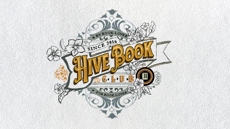
Seeing that I had the central aspect defined, it was time to incorporate the ornamental elements of plants that would give freshness and be representative of the members of the community.
From the central ribbon, I decided to draw the plants and flowers emerging
I also wanted to add a small foundation stamp; but not knowing the exact date, I consulted the HBCC contest post and they kindly answered me promptly.
It took me about 2 hours to sketch the linear decorations, plants and leaves, capturing references [1].
Once the final sketch was completed, I polished the details before exporting it to Adobe Illustrator to begin vectorisation, ensuring the highest quality delivery.

DESIGN DECISIONS
Ornaments
Estos representan herencia y tradición, además que evocan una sensación de estilo creativo de forma clásica. En sí siento que esta comunidad se mantendrá por años y por más que pase el tiempo siempre habrá una tradición que se mantenga gracias a los integrantes. Por ejemplo incluí una figuras ,en los extremos verticales de la composición de logo, en forma de de personitas simplificadas que salen volando y esto representaría la libertad que nos da la lectura y el uso de esta comunidad para relacionarnos con otras personas con los mismos gustos.Flowers and plants
I wanted to represent with these elements the vitality of the members, and the development of people through reading; I even consider this part as a connection with our nature and the outside nature.Ribbon
This element is essential to my design as without it the name of the community would not stand out, and this is important for it to be seen both on a large scale from afar and on a small scale. Within the ribbon I have the comfort of placing the name without distractions.CLUB
By including the word "CLUB" it would look too long and would break the visual harmony I was achieving at the time; this is how I would have to lower it but without downplaying its importance, the rest is a matter of the designer's critical sense.
Colour
The choice of colours can have a significant impact on the perception and visual identity of a logo.
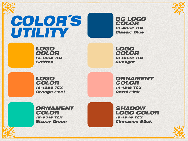
The choice was simple as I had the instructions in the section of the HBC contest post; I wasn't convinced at first but after trial and error I managed to match a set of colours to apply to the logo.
 |
|---|
A. Saffron:
It represents vitality, energy and optimism.
B. Orange Peel :
Suggests creativity and adventure.
C. Biscay Green :
It evokes a refreshing and calm feeling, associated with nature.
D. Classic Blue :
It represents stabilit
E. Sunlight :
It brings warmth and luminosity.
F. Coral Pink :
Symbolises positive energy and affection, associated with peace.
G. Cinnamon Stick :
Adds depth and warmth, associated with earth.
Typography
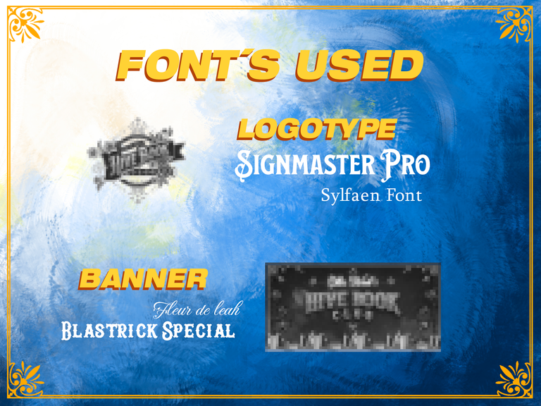
Only and exclusively for this particular case of HBC, I decided to use 4 types of fonts that together have a visual harmony and are not each one a different world but that match the idea of the concept of the logo that I propose.
Tools used:
- Design Software: Photoshop
- I was able to obtain the typography from the image generation on the web, and then modify it to my liking to avoid complications in terms of commercial use.
 |
|---|
Fonts used for the logo:
Main Source: Signmaster Pro
- I chose this one in particular because it is a serif type (which fits with the idea of representing visual decoration) as well as having a robust body that would allow me to modify it freely without losing legibility.
In the case of the HBC logo it could be considered a modification of a main typeface and therefore it is a single application.
Secondary Source: Sylfaen
- The SYLFAEN font I got it exploring in BEST FREE FONTS, I had used it some time ago for a cover design, and I had it in my favourite fonts folder because it gives me just enough serif to not overshadow the main font or as I personally call it "SUPPORT FONT". In this case I used it for the date phrases and the tag line inside the logo.
Fonts used for banners:
Main Source: Blastrick Special
- I had planned to use it in my folder of robust fonts, but it looked flat, without volume, so I added some effects in Photoshop to give it more presence in the composition of the banners and make it match with the support font.
Secondary Source: Fleur de leah
- I consider myself lucky to find it, as I had never seen it before, and for this case after 3 days of relentless searching I found it and knew at first glance that it was the one chosen to accompany the main typeface and highlight the design. It gives a natural and delicate air while remaining legible and elegant, and it is in keeping with the concept of the logo.
DESIGN EVOLUTION
MUSIC BY DISCLOSURE - YOU & ME (FLUME REMIX)
Presentation of the Logo
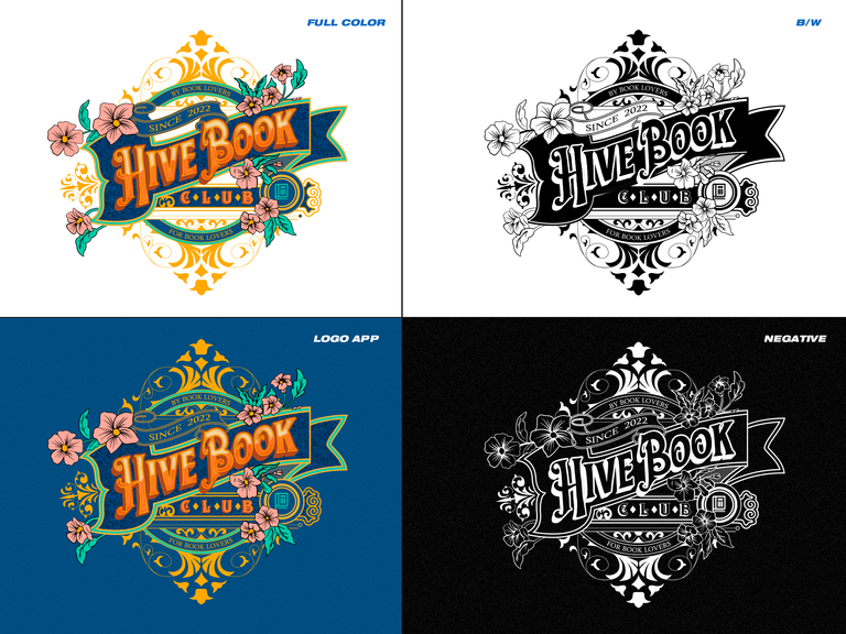
- In the first quadrant I place the logo in full colour without background.
- In the second quadrant I place the logo in its black and white version for practical uses.
- In the third quadrant I place the application of the logo on the only allowed colour: Classic Blue 19-4052 TCX of PANTONE (and it is a rule that I put to avoid loss of legibility).
- In the fourth and last quadrant I place the logo in its negative version, for practical uses as well.
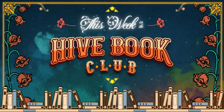
Presentation of the Banners
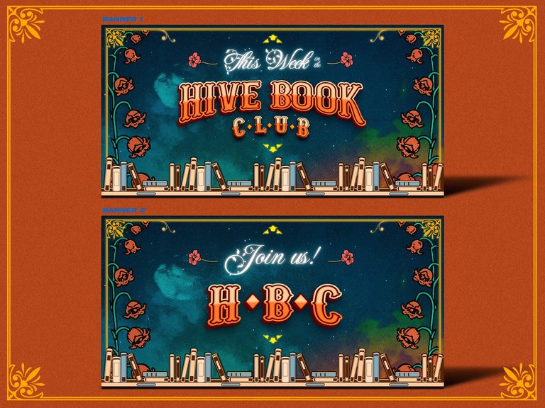
Here I use the same logic that surrounds the logo, I only varied the font for a different application, but I don't mean that you can change the typography just like that, but this is a unique exception because in the section where I mention the typographies it is clear that in the universe of the creation of this logo there are only 4 typographies and each one of them has its role in each application.
I devised a frame representative of the community as this would bring great value of elegance to highlight the future compositions, this element was inspired by the classic book covers.
In the complexity of layers over layers, textures over textures, is the richness of the result of the banners, it was a hard work but in the end I saw that it was good and I managed to capture my idea.
Customised banner and divider presentation
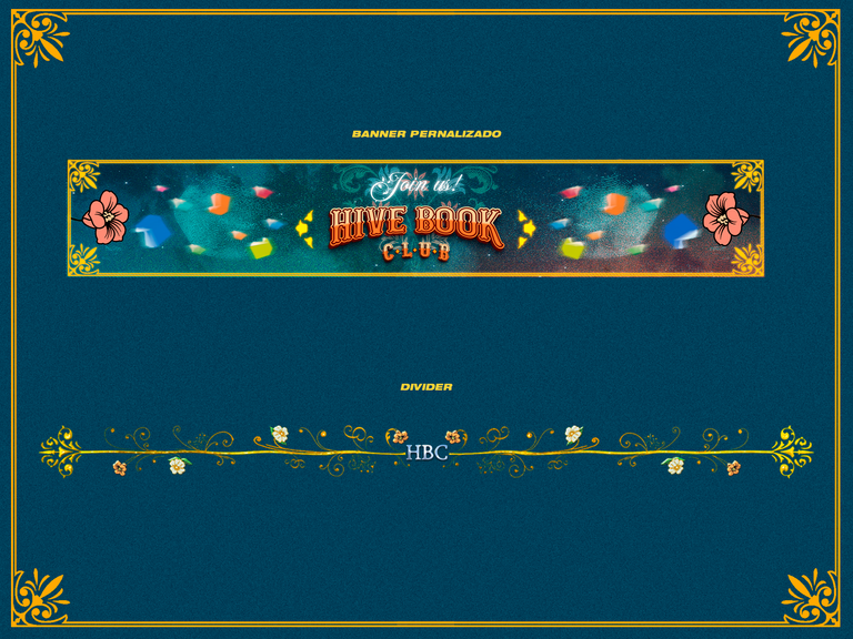
Design an extra banner with custom dimensions, it is a third of the height of the main banner and can be used as a footer for post goodbyes.
I have the divider design, which I did by first drawing a straight line and then distorting it with a distortion filter in Photoshop and then I took the logo ornament protruding from the loop on the left side of the logo and placed them at each end of the divider.
This way I managed to create a kind of branch joined at both ends and on the centre line protruding flowers and more ornaments, to top it off I placed the HBC acronym in the centre.
The gold and silver effect on the divider was achieved using Alien Skin's Eye Candy tool.
CONCLUSION
In this post, I've shared my logo proposal for Hive Book Club, detailing each step of the creative process and the decisions made in the design. From the initial inspiration to the initial sketches and refinement process, I've tried to convey the essence of the community through a distinctive logo.
The colour palette shared in the contest post was broad, so I selected certain colours to evoke specific emotions associated with reading, creativity and stability. The inclusion of classic ornaments is intended to represent tradition, reinforcing the idea of an enduring community, as well as elegance.
The use of Alien Skin's Eye Candy tool to apply silver and gold effects on the line elements and end figures adds a special and distinctive touch to the divider design, contributing to its visual appeal.
I am grateful for the opportunity to contribute to Hive Book Club's visual identity and hope that this proposal will be embraced with the community. I am open to feedback and tweaks, working together to create a visual representation that everyone can feel as their own. Thank you for being part of this exciting creative journey! 📚✨
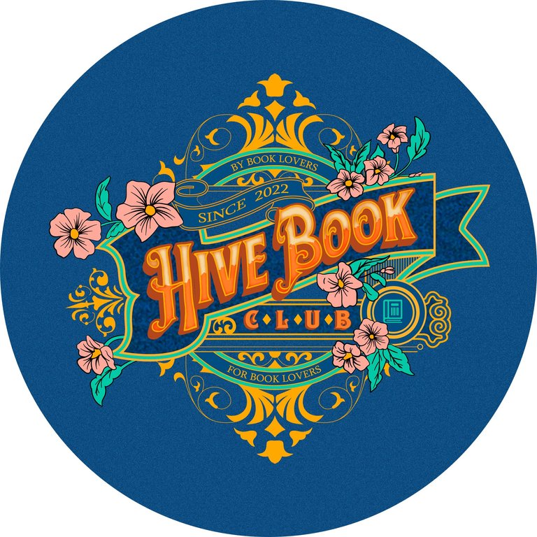
Logotipo aplicado para el perfil
Banner principal
Banner secundario
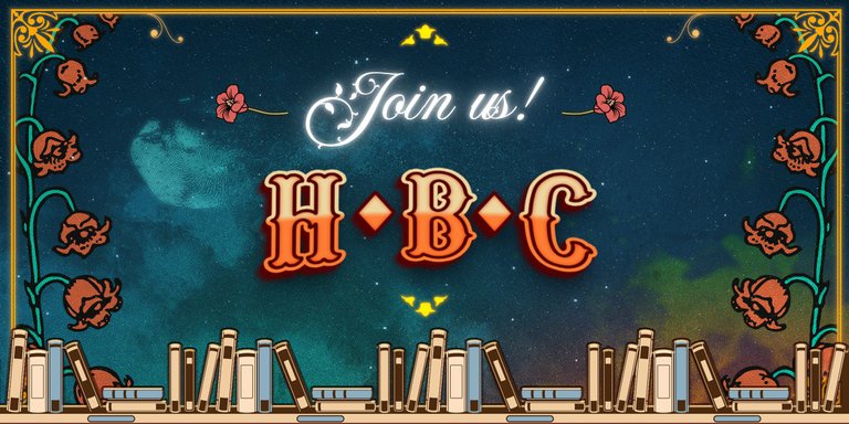
Divisor

Banner personalizado


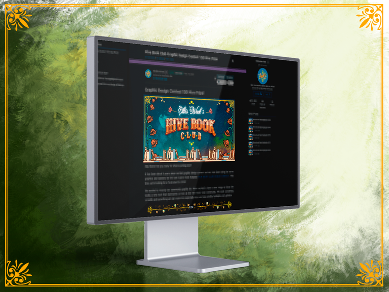
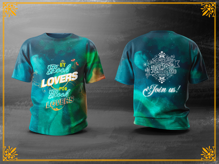
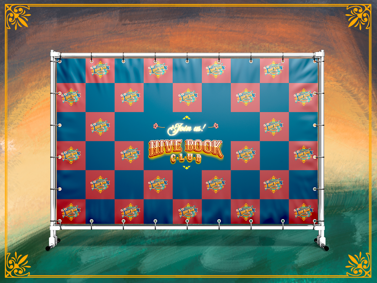
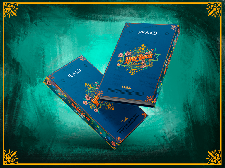
APPLICATION MOCKUPS
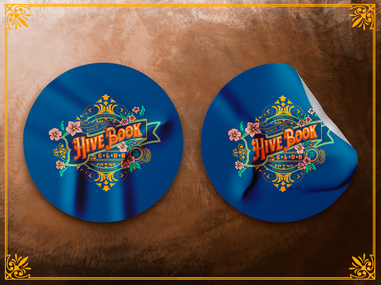

I used Photoshop
to edit ALL the images, which you see in my publications
Usé Illustrator
Textures from my own warehouse
I used DAVINCI RESOLVE
to edit the video of my post
Text translated in: Deepl

Congratulations @bmo77! You have completed the following achievement on the Hive blockchain And have been rewarded with New badge(s)
Your next target is to reach 20 posts.
You can view your badges on your board and compare yourself to others in the Ranking
If you no longer want to receive notifications, reply to this comment with the word
STOPTo support your work, I also upvoted your post!
Check out our last posts:
I like that bit of antiquaty feel to the logo, and the mix of the colors in general on the banner.
Nicely done, and happy holidays.
Thnks bro, and happy new year 😉
This is super creative! we're rolling out the announcement soon.